Chicago
Frame, Rowan. “II. ‘I Can Hardly Write, for Looking at the
“Silvery Clouds,” and Skies’: Attention and Materiality in
Constable’s Sky Sketches in Oil on Paper.” In
Materia: Journal of Technical Art History (Issue
3), by Lucretia Kargère, Ramon Solé, Federico Caró, José Luis
Prada, Núria Guasch-Ferré, Antje Bosselmann-Ruickbie, Rowan
Frame, Leila Sabouni, Ainslie Harrison, and Kirsten Moffitt. Los
Angeles: Materia, 2022. http://localhost:8080/essay_frame/.
MLA
Frame, Rowan. “II. ‘I Can Hardly Write, for Looking at the
“Silvery Clouds,” and Skies’: Attention and Materiality in
Constable’s Sky Sketches in Oil on Paper.”
Materia: Journal of Technical Art History (Issue
3), by Lucretia Kargère et al., Materia, 2022,
http://localhost:8080/essay_frame/. Accessed
DD Mon. YYYY.
II.
“I can hardly write, for looking at the ‘silvery clouds,’ and
skies”: Attention and Materiality in Constable’s Sky Sketches in
Oil on Paper
Rowan Frame
Attention, and the role it might have played in the
sky-sketching practice of the British artist John Constable,
is the focus of this article. After outlining what is known
about Constable’s practice as a result of analytical
investigations, the article documents an experiential
approach to investigating his materials and methods. It
recounts an attempt to reconstruct those intangible values
such as pleasure and attention that may have been inherent
in the practice of sky sketching. In doing so, it aims to
demonstrate the extent to which it is possible to discuss
the “materiality” of attention, which may be pertinent when
considering artworks produced in, and inspired by, an age
that put such value on the senses, feeling, and emotion.
*This article has been approved for publication by peer
review.
ExpandVideo 1This compilation of stop-motion videos shows author Rowan
Frame ‘skying’ in the style of John Constable, both in the
studio and outdoors.
Artists have engaged in outdoor sketching for centuries, but
the practice gained momentum in Europe through the eighteenth
and nineteenth.1
Driven by a growing conviction in the intrinsic religious,
moral, and aesthetic value of the natural landscape,2
and a concomitant waning in the belief that artists should
only record nature indirectly through academic artistic
conventions,3
a growing interest developed in observing and recording nature
firsthand. As outdoor sketching became increasingly common, so
did studies of the sky.4
Although many artists engaged in sketching the sky,5
British painter John Constable (1776–1837) stands out as the
most dedicated.6
The intensity of his study of the sky—estimated at nearly a
hundred oil sketches produced only in 1821 and 1822—has
prompted much scholarly musing into the motivations behind
it.7
The factors that may have prompted Constable’s devoted sky
studies have been comprehensively discussed in essays by Louis
Hawes and Anne Lyles, both of whom stress the interrelated
multiplicity of his motivations and the dangers of inflating
the importance of one over any other.8
Constable’s broad interests and wide reading exposed him to
numerous influences; poetry, and literature across
meteorology, theology, and art theory, are all likely to have
encouraged his “skying” (the term Constable himself used for
his sky sketching).9
He was also very likely to have been influenced by other
artists’ cloud studies that he saw and copied, such as those
by Willem van de Velde the Younger (1633–1707), Claude
Lorraine (1600–1682), and Alexander Cozens (1717–1786), as
well as paintings by seventeenth-century Dutch and Flemish
landscape artists.10
The sky was of utmost importance to his landscape
paintings—the “chief organ of sentiment” and the “standard of
scale,” as he put it.11
Therefore, it follows that Constable would have wished to
paint skies, with the freedom to experiment that sketching
allows.
And yet, while Constable’s known interests, motivations, and
influences are vital to our understanding of his practice,
they cannot provide an entirely satisfactory explanation for
the sheer number of studies he produced.12
For instance, while some of the literature he is likely to
have read explicitly encouraged the sketching of skies,13
it cannot fully explain the gusto with which he pursued such
an endeavour.14
Indeed, Constable appears to have cultivated such a strength
of habit of attending to the sky—a “‘Wordsworthian’
hyper-receptiveness”15—that he occasionally appeared unable to do very much else:
“I can hardly write,” he wrote to C. R. Leslie on 16 August
1833, “for looking at the ‘silvery clouds,’ and skies.”16
It is important also to acknowledge that the purpose of his
skying does not appear to have been solely for the improvement
of artistic technique. Indeed, scholars have noted that the
skies in Constable’s finished paintings completed after his
intense skying of 1821–22 are not particularly distinguishable
from those he painted before.17
And unlike some of his European contemporaries who used their
sky sketches directly as reference material for finished
works,18
there is little evidence that Constable used his in this
way.19
As such, part of the scholarly interest in Constable’s skying
includes a fascination with the level of attention he devoted
to something that did not directly impact his artistic
technique. After all, embodied in the familiar phrase “paying
attention” is the implication that attention costs us
something and that we should expect something in return.20
Perhaps—posit those scholars who have considered Constable’s
motivations—the value of skying lay in the pleasure of the
activity: “by 1822 he may have begun sketching clouds without
any definite ulterior motive, and perhaps had come to look
upon his studies (privately) as end products, enjoyable for
themselves.”21
Pleasure, attention, and the conditions that relate one to the
other, are themes that pervade Romantic discourse, and
Constable would have found plenty on the topic in his own
library.22
For instance, a central idea of Edmund Burke’s
Enquiry into the sublime is the interaction of the
sublime with feelings of pain and pleasure: the way in which
the sublime is felt through “contemplating”—or paying
attention to—“terrible” objects.23
And indeed, Burke’s definition of the sublime in nature refers
to the natural world’s capacity to induce a particular and
involuntary state of attentiveness: “the mind is so entirely
filled with its object, that it cannot entertain any
other.”24
Similarly, according to William Hazlitt, an artist is someone
possessing particular powers of attention—“by habit he is led
to perceive all those distinctions in nature, to which other
persons never pay any attention”25—and through this heightened perceptive mode, an artist has a
greater capacity for pleasure: “a pleasure in art which none
but artists feel.”26
The artist’s particular abilities to attend to, take pleasure
in, and manifest in material form their object of
contemplation was the mechanism by which the viewer, or
reader, could, in turn, take pleasure in and make use of art—a
“pleasure derived from imitation” that “opens a new field of
inquiry.”27
Of course, an interest in questions of pleasure and attention
did not conclude with the nineteenth century; such
intellectual preoccupations continued into the twentieth and
twenty-first centuries, albeit in different forms and with
different foci. This is perhaps most apparent in the writings
of various British psychoanalysts, an unsurprising finding
when one considers the importance of attention and inattention
to that particular discipline.28
For example, there is the work of Marion Milner, which “tries
to describe the body’s forms of attention, and our attention
to bodily states”;29
and which seeks constructive uses for such states oriented
towards a creative experience, or “transitional experience,”
as the term was later coined by another psychoanalyst, Donald
Winnicott.30
With this in mind, it is worth noting the degree to which the
rediscovery of the plein air tradition coincided with the
development of, and concomitant interest in, such
psychoanalytical discourse.31
For example, Arthur Conisbee, a pioneering collector and
historian of eighteenth- and nineteenth-century landscape
sketches,32
drew upon the “psychoanalytic-aesthetic” theories of Adrian
Stokes to propose that, even before the Romantic period,
“painting from nature was felt as a pleasure in itself. . . .
Indeed, a large part of that pleasure is in being taken out of
oneself.”33
Attention, and the role it might have played in the skying
practices of artists such as Constable, is the focus of what
follows, both its topic and its mode of inquiry. Simply put, I
summarise, through the lens of attention, those materials and
methods that were used in the making of sky sketches. More
specifically, after outlining what is known about Constable’s
skying practice as a result of analytical investigations, I
recount an attempt to reconstruct something close to skying.
This involved mocking-up the materials used by Constable,
transporting these outdoors, and recording observed skyscapes
in paint; the exercise was informed by artists’ treatises, my
own examination of sky sketches attributed to Constable in the
collection of the Fitzwilliam Museum, Cambridge, and technical
studies of Constable’s materials and methods—a large
proportion of which are the work of Sarah Cove, who has
published extensively on this area.
Constable’s Process
Constable executed sketches in oils on paper during his
intense skying period of 1821–22.34
Examination and technical study of these sketches have shown
that he often laminated thin sheets of paper together with
glue before applying a coloured ground layer to his homemade
supports.35
The prepared coloured grounds were likely to have helped him
to execute studies in one layer while taking advantage of an
expanded range of colouring effects, such as turbid medium and
simultaneous contrast.36
He would generally then cut these prepared supports to sizes
that fitted within the lids of his painting boxes, and would
transport these, along with oil paints in vials or bladders
and brushes, outdoors to sketch.37
He would execute sketches rapidly, wet-in-wet and in one
sitting before the scene, resting his sketches against the lid
of his box.38
Constable appears to have been unusual among his British
contemporaries in his preference for sketching outdoors in
oils on paper.39
British artists tended to prefer less cumbersome monochrome
methods or watercolours, and only the Welsh artist Thomas
Jones (1742–1803) is known to have preceded Constable in
sketching skyscapes using oils on paper.40
This method was common in France, however, and gained momentum
by the 1770s.41
Hawes notes that Constable’s 1743 edition of the English
translation of Roger de Piles’s French treatise, which
recommends making direct studies of the sky at different times
of day and different seasons,42
may have influenced his decision to embark on his skying
campaigns.43
The same treatise may also have influenced his choice of
method; about painting in oil on paper, de Piles wrote that it
is “doubtless the best for drawing nature more particularly,
and with greater exactness,” compared to monochrome methods,
despite it being a somewhat cumbersome method requiring
“several implements.”44
On the colours of clouds, de Piles urged that they be painted
by direct observation since these effects are difficult to
conceive of “by physical reasons”:45
“Who can tell, for example, why we see, in the bright part of
some clouds, a fine red, when the source of the light which
plays upon them, is a most lively and distinguishing
yellow?”46
De Piles appears to have been continuing a tradition of advice
in painters’ manuals on the importance of observing and
recording the colours of clouds; such instruction had appeared
frequently in painting treatises prior to that by de
Piles,47
including as early as the sixteenth century:
The mixtures of clouds are taught by the heavens themselves.
The colors of clouds should be painted according to the many
different shades which may be observed daily in the
firmament. Every illuminator and painter I would therefore
refer to the exalted Creator of the heavens, who colors them
with so many wonderful tints, so that they appear
ash-colored, fire-colored, red, reddish yellow and in all
sorts of mixtures. An attentive pupil must therefore always
see to it that he imitates such heavenly mixtures carefully
in colors. Also the distribution of the clouds spread hither
and thither over the blue sky. When painting the clouds,
observe and attend well” (Boltz von Rufach, 1549).48
Beyond materials and method—colour versus monochrome, oils
versus watercolour—the process of producing a sketch would
have presented Constable with a series of further choices. An
artist must attend, to various degrees and at various moments,
to the colours and form of the subject, their materials, their
technique, the sketch in production, and perhaps their own
responses to all of these. For how long, then, in what manner,
and to what extent should each of these elements
absorb the artist? The beginnings of an answer to these
questions can perhaps be found in the writing of the French
artist Pierre-Henri Valenciennes (1750–1819), who sketched in
oils on paper.49
In his own treatise, published in 1800, Valenciennes was
directive about where and how he thought an artist’s attention
would be best placed. He recommended that
etudes d’apres nature should be done quickly, with
attention focused on subject; the artist should not be
distracted by too many details, nor by attempting any “finish”
as would be conventionally expected of a studio oil
painting.50
In addition, he advised spending a maximum of two hours on a
subject, or half an hour if it was a fleeting subject such as
a sunset;51
after this, the sketch would cease to be true to nature, and
the artist should move on.52
Constable’s sketches themselves provide some evidence that his
practice was similar to that recommend by Valenciennes. The
inscriptions he tended to write on the reverses of his
sketches suggest that he completed his skyscapes quickly,
within one hour.53
Constable reduced the inherently distracting nature of oil
painting by minimising tools and pigments, and by using small,
lightweight, easily transportable supports prepared with a
layer of colour that could contribute to the final effect of
the sketch.54
Pinholes, squashed impasto, and lumps of dried paint from the
palette on Constable’s sketches55
might suggest his attention was fully occupied by recording
his subject, with none devoted to careful finish. His sketches
could be considered as material records of his attention.
In preparation for re-creating Constable’s skying process,
which is described in the following sections, three sky
sketches in oil on paper in the Fitzwilliam Museum that are
attributed to Constable, although somewhat tentatively, were
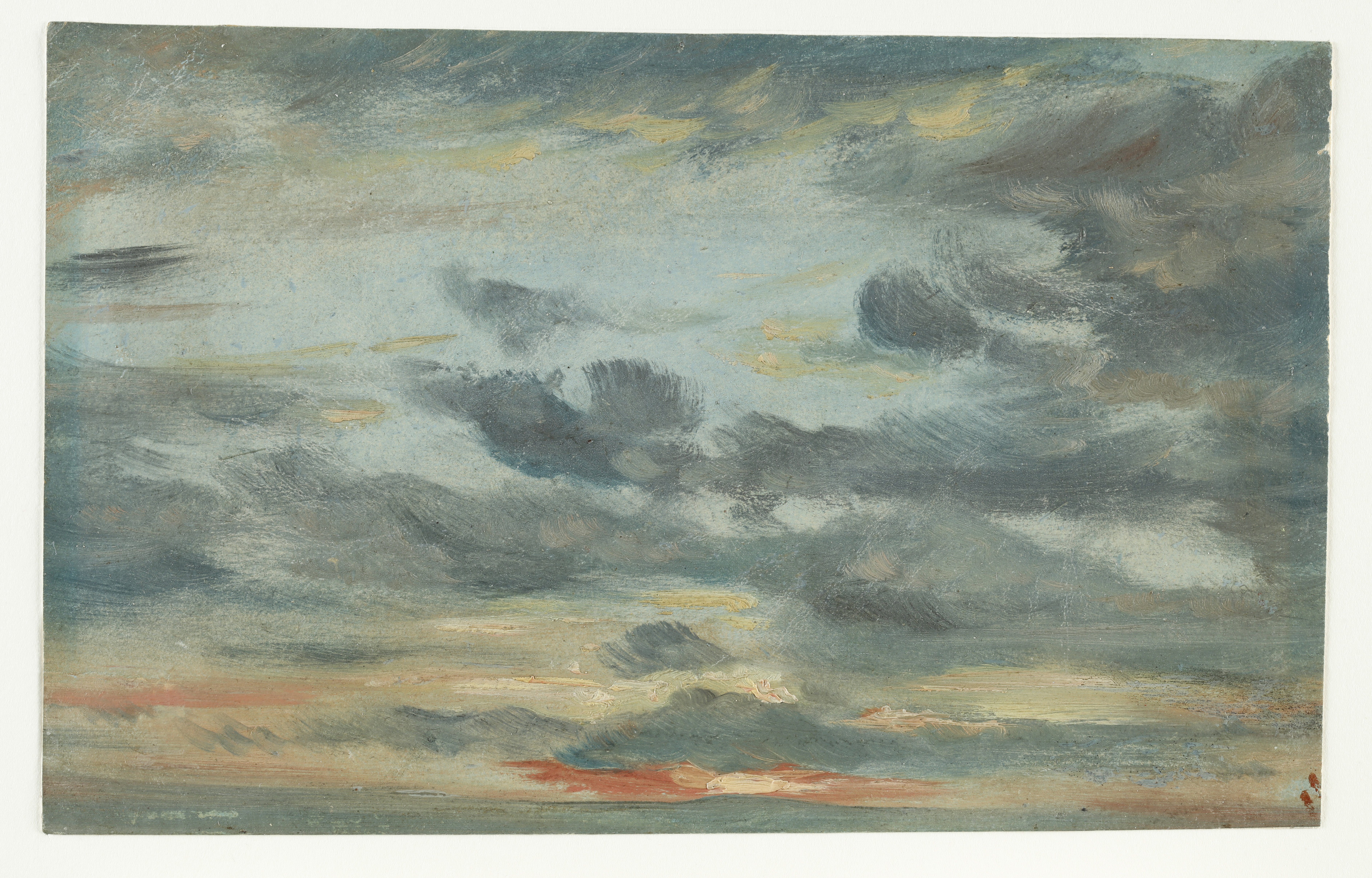
examined: Sky Study, Sunset (PD.7-1961);
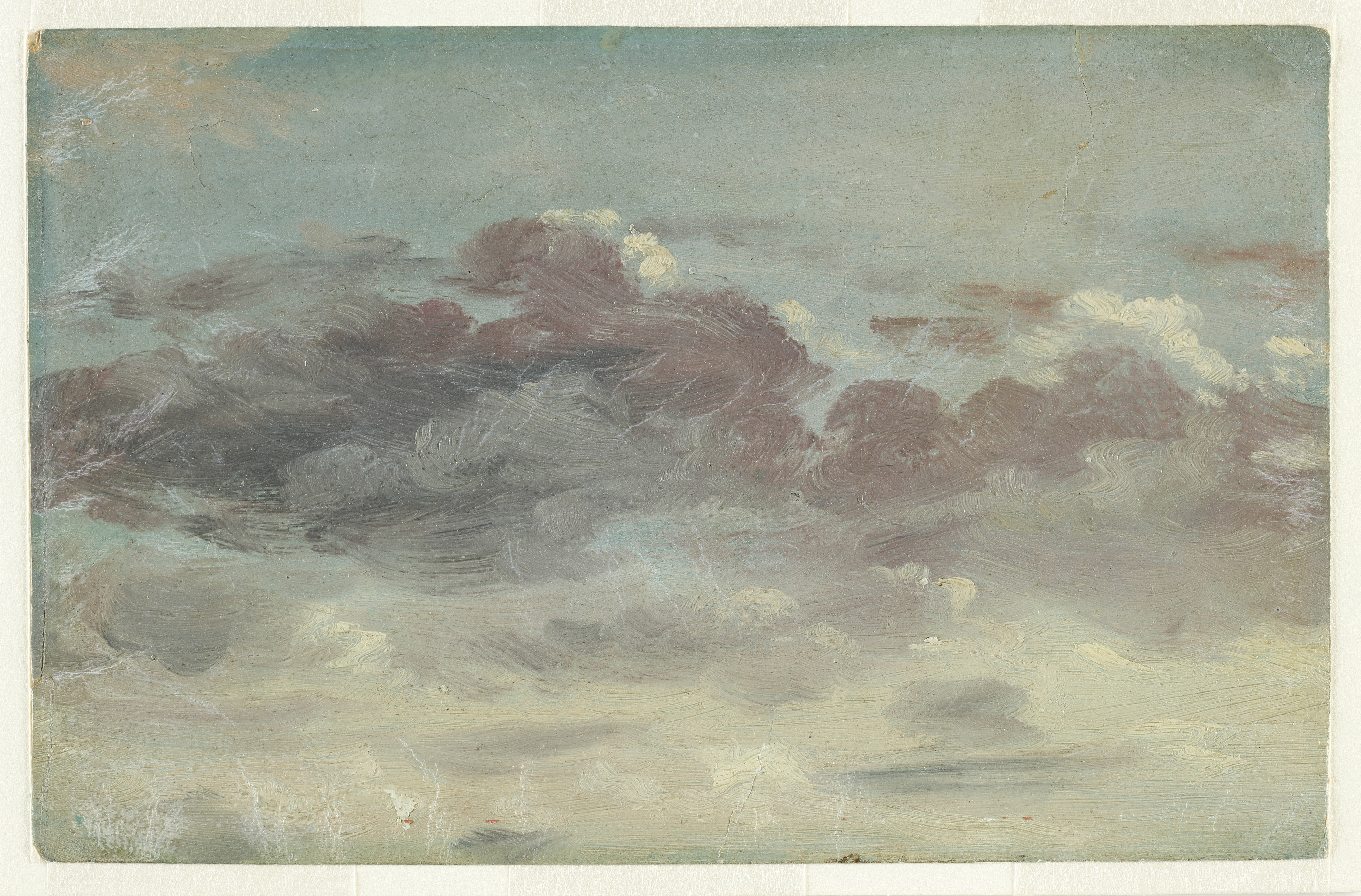
Sky Study with Mauve Clouds (PD.8-1951); and
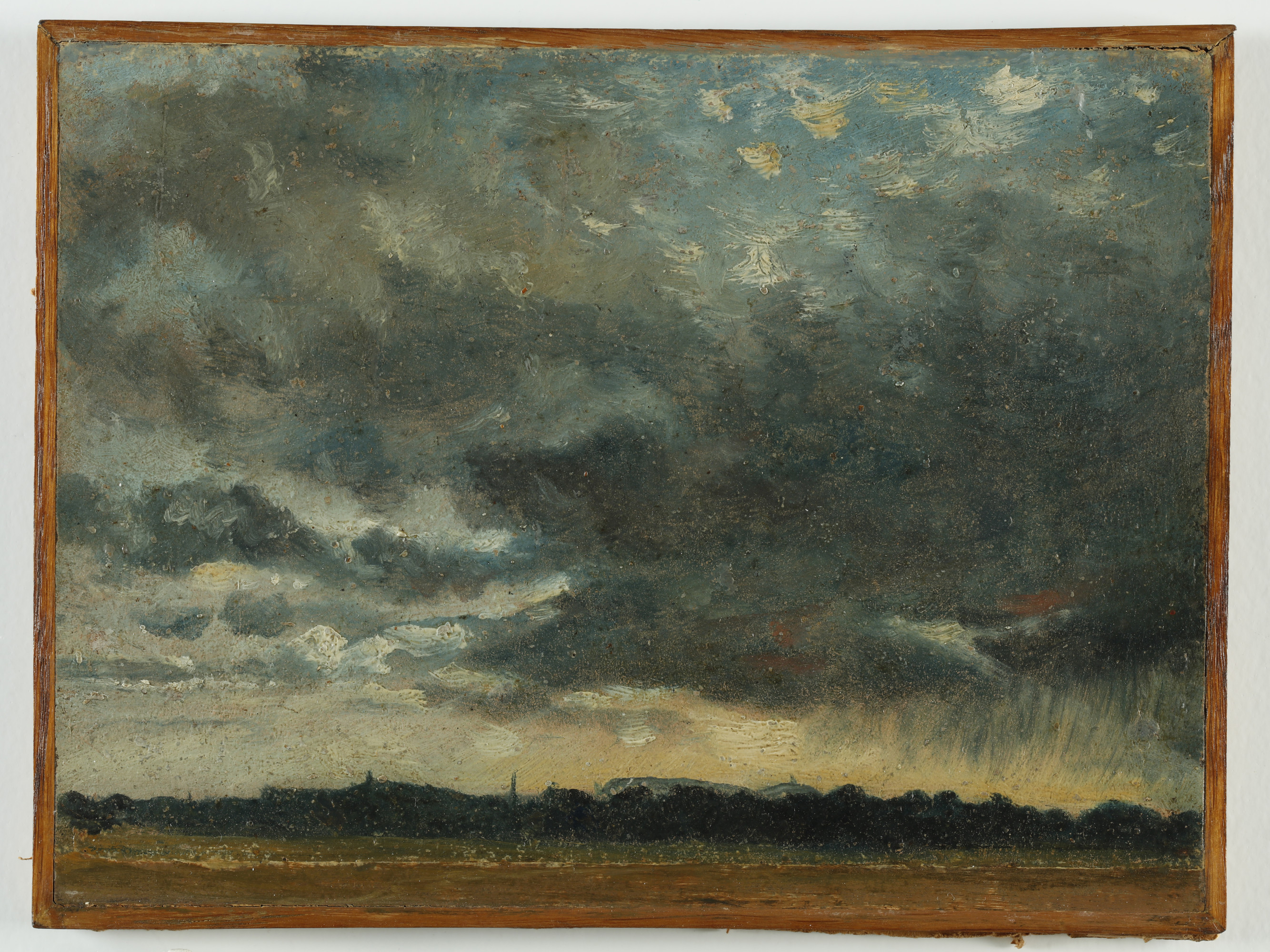
At Hampstead Looking towards Harrow (PD79-1959).56
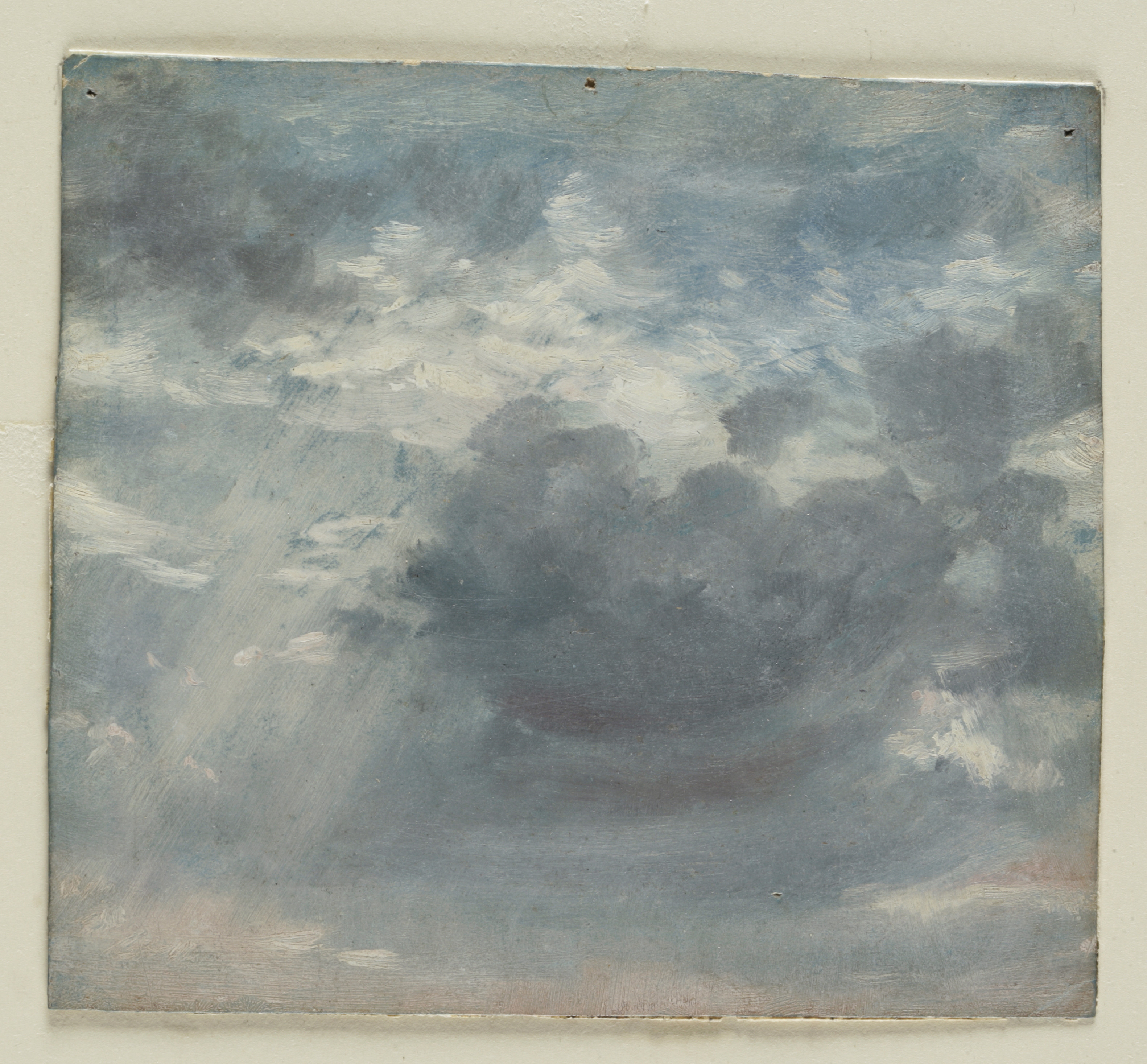
Photographs and micrographs of
Sky Study with a Shaft of Sunlight (PD.222-1961) by
Constable were also studied, but this sketch was on loan at
the time of examination.57
For brevity these sketches will be referred to hereafter as
Sunset, Mauve Clouds, At Hampstead,
and Shaft of Sunlight (Figs. 1–4).
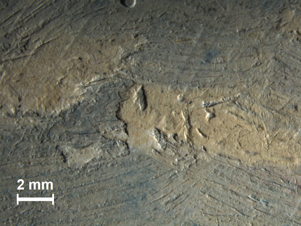
ExpandFig. 1Attrib. John Constable, Sky Study, Sunset,
ca.1821-22, oil on paper laid on paper, 14.5 x 23.0
cm. Fitzwilliam Museum, Cambridge PD.7-1961. Digital
image courtesy of Hamilton Kerr Institute and
Fitzwilliam Museum.ExpandFig. 2Attrib. John Constable,
Sky Study with Mauve Clouds, ca.1821-22, oil
on paper laid on paper, 14.2 x 22.2 cm. Fitzwilliam
Museum, Cambridge PD.8-1951. Digital image courtesy of
Hamilton Kerr Institute and Fitzwilliam Museum.
ExpandFig. 3Attrib. John Constable,
At Hampstead Looking towards Harrow,
ca.1821-22, oil on paper laid on wooden panel, 16.5 x
23.4 cm. Fitzwilliam Museum, Cambridge PD79-1959.
Digital image courtesy of Hamilton Kerr Institute and
Fitzwilliam Museum.ExpandFig. 4John Constable,
Sky Study with a Shaft of Sunlight,
ca.1821-22, oil on paper, 13.6 x 15.0 cm. Fitzwilliam
Museum, Cambridge PD.222-1961. Digital image courtesy
of Chris Titmus, Hamilton Kerr Institute and
Fitzwilliam Museum.
The four sketches have the appearance of having been painted
rapidly and in one sitting with a stiff brush. The sky scenes
are executed in one lean paint layer directly on top of a
coloured ground without any discernible preparatory drawing,
and in all the studies the sky and clouds are painted thinly
with impasto limited to the final highlights, which are
applied last of all. The clouds have been worked up wet-in-wet
and are painted thinly, but opaquely. Mixtures appear to have
been rapidly created on the palette, creating a marbled effect
in some areas. In other areas whites, blues, pinks, and
yellows have been applied in thin scumbles with colours
dragged over one another and minimal blending to create masses
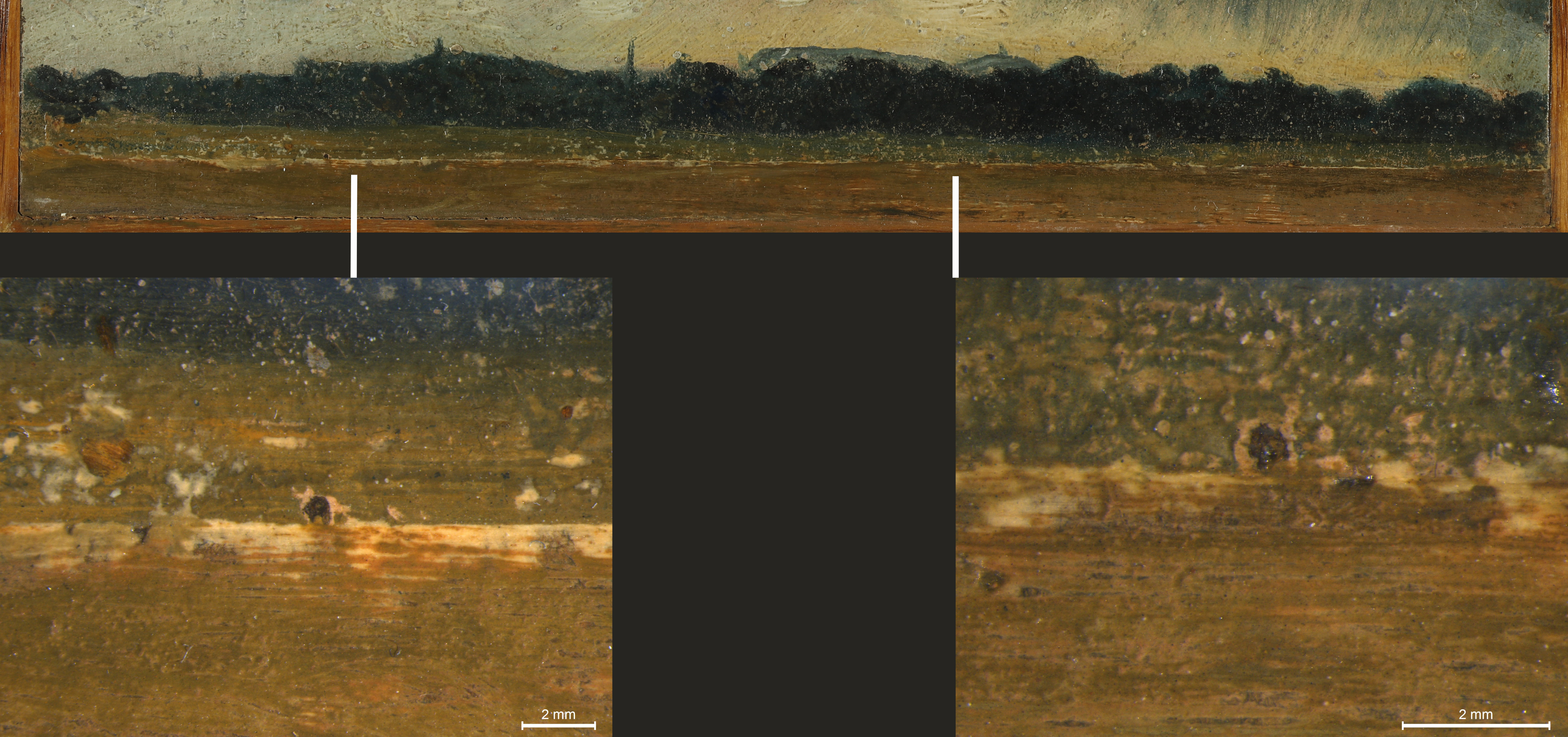
of clouds. At Hampstead differs from the other
studies in that it includes a narrow strip of landscape, but
the landscape also appears to have been worked up roughly
concurrently with the sky—the sky paint overlaps the horizon
in some areas and the horizon has been reinforced over the sky
in others. The prepared coloured grounds do much of the work
towards the final effect; the ground is left to show between
passages and broken brushstrokes, and the blue ground serves
to provide much of the background sky in Sunset.
Where covered by paint, the ground still shows through in many
areas since the paint has a very particular texture that
retains the brushstrokes and is thin enough to remain
transparent where bristles have left furrows in the paint;
this is particularly the case for Mauve Clouds, on
which there is extensive use of these brush-marked layers.
The studies examined survive in good condition with no
adhesion issues in paint layers, or even any discernible
craquelure. There are, however, creases and restored tears in
the supports. Excluding Shaft of Sunlight, the
studies’ original supports are difficult to assess as the
reverses are covered by non-original secondary supports.
At Hampstead’s support has been laid into a wooden
tray while the supports of Sunset and
Mauve Clouds are laid down on paper.58
A centimetre-wide strip has been added along the bottom edge
of At Hampstead, corresponding to the green area of
the foreground landscape, at a later point than the sketch’s
execution.
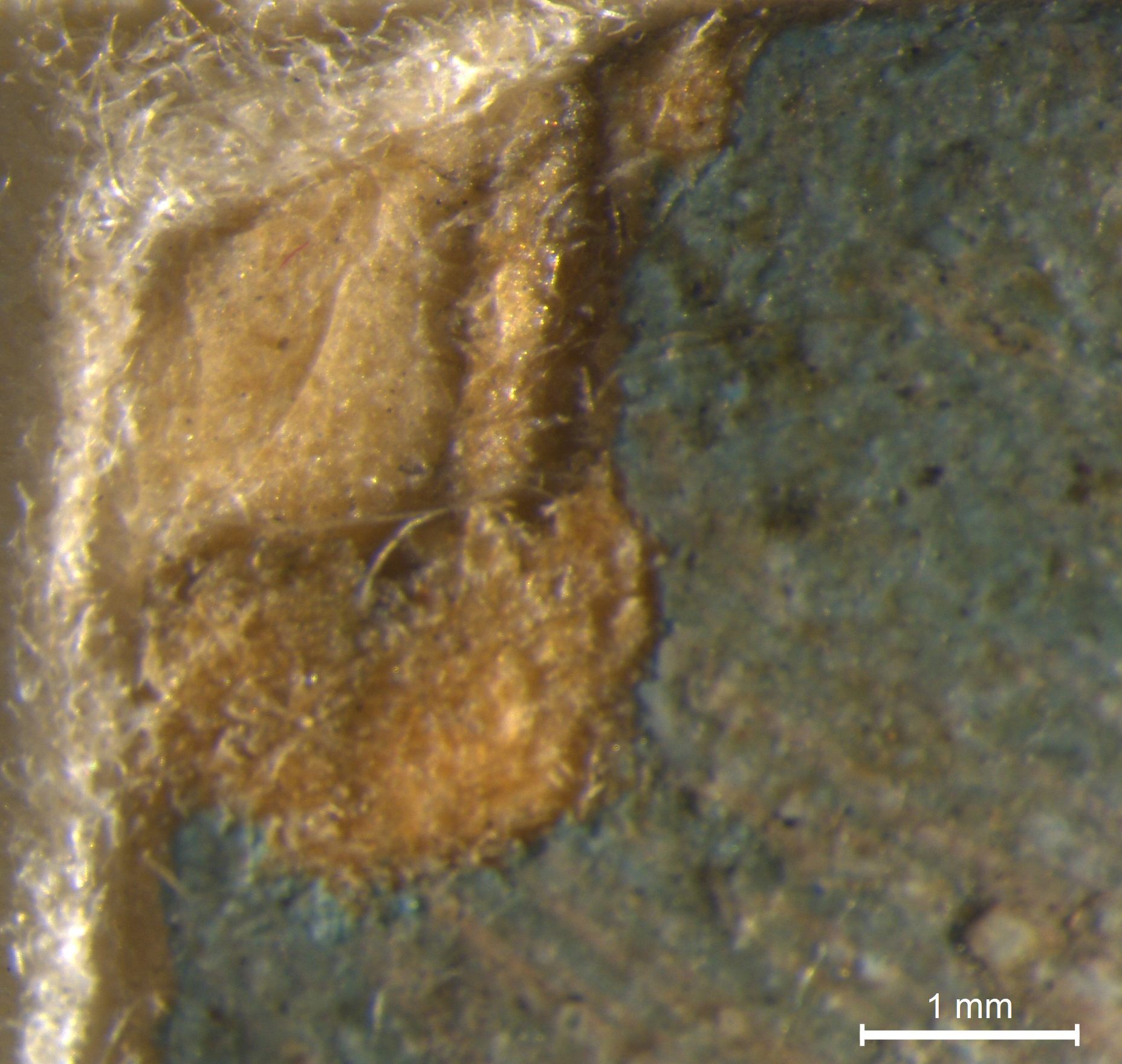
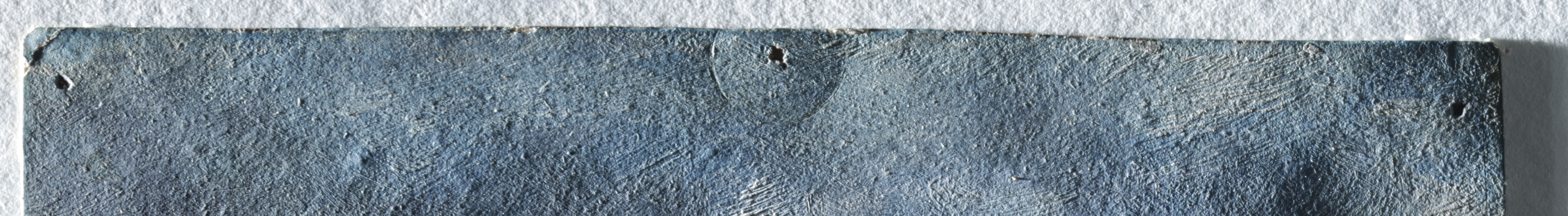
ExpandFig. 5Sky Study with Mauve Clouds micrograph of top
left corner showing laminated paper support layers.
Fitzwilliam Museum, Cambridge PD.8-1951. Digital image
courtesy of Hamilton Kerr Institute.
All three of the examined sketches were found to have been
created with materials and methods similar to those Constable
is known to have used based on technical studies of his
sketches.59
Constable used an array of methods to depict different weather
effects, including scumbled layers with varied opacities.60
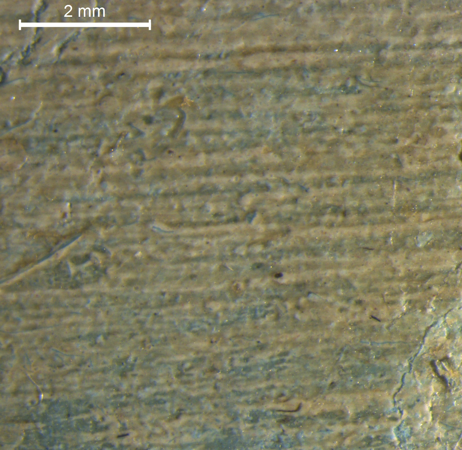
The sketches are on laminated paper supports (Fig. 5) and are
painted with the same limited range of pigments typically used
by Constable.61
These findings are not sufficient to confirm an attribution to
Constable. Nevertheless, the sketches do seem to have been
executed in the same spirit of attention to nature that
Constable exercised: the sketches were executed quickly and
directly, in one lean layer onto a coloured ground (Figs.
6–8); pinholes and squashed impasto are present, possibly
having occurred as part of the process of painting outdoors
and transporting wet sketches (Figs. 9–13); a lack of regard
for finish is hinted at by dried paint and other materials
caught in paint layers, and by wet paint transferred
apparently accidently onto one of the sketches (Figs. 14–16).
Therefore, despite the lack of a firm attribution, the
sketches examined were deemed suitable and useful references
while attempting a reconstruction of the materials Constable
used and the process he followed.
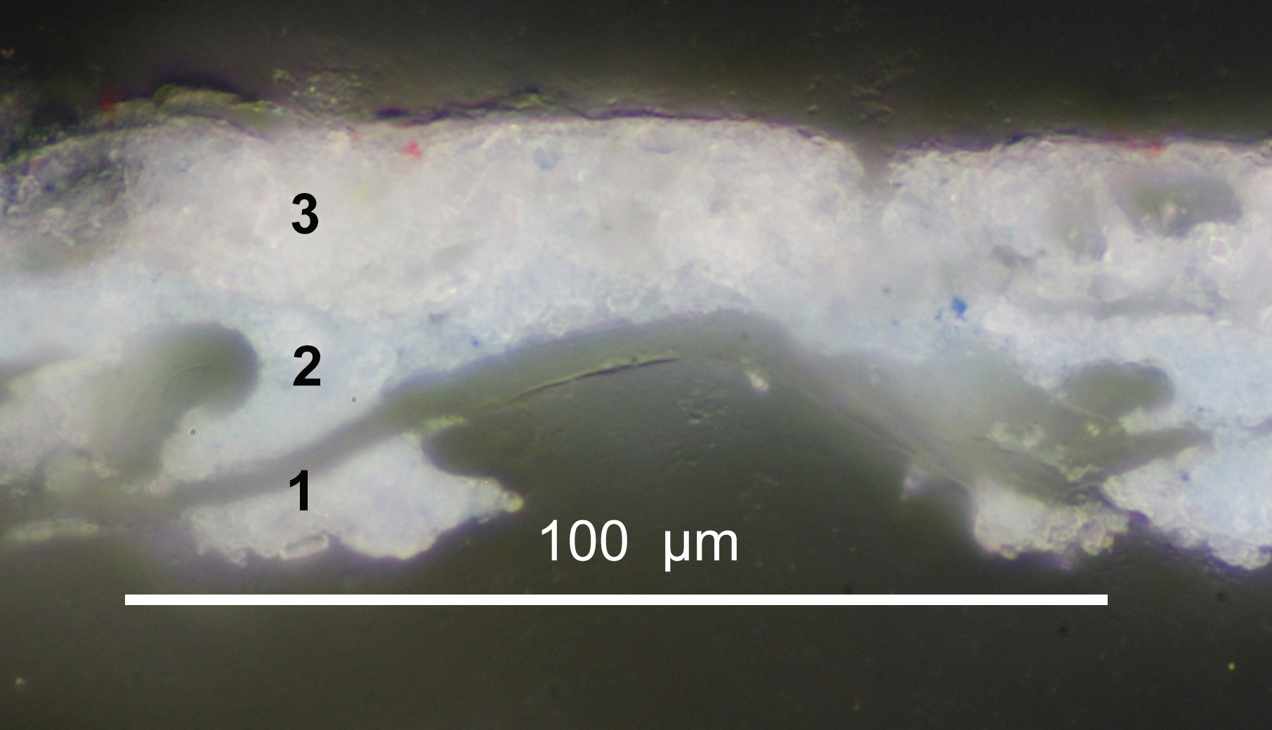
ExpandFig. 6Sky Study with Mauve Clouds magnified paint
sample viewed in cross-section showing: 1. fibres of
paper support; 2. pale blue ground layer; 3. thin
paint layer applied wet-in-wet onto the dry ground
layer. Fitzwilliam Museum PD.7-1961. Digital image
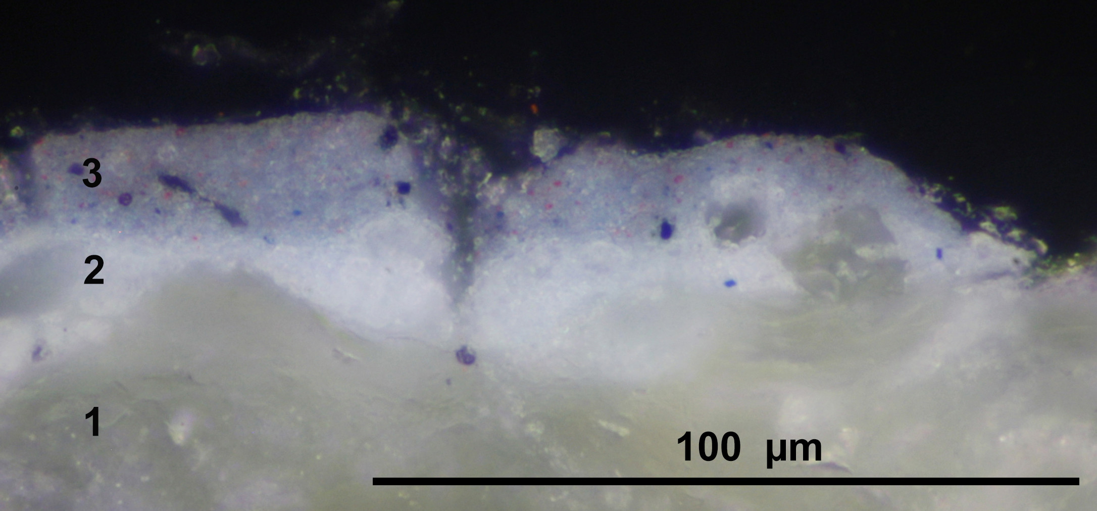
courtesy of Hamilton Kerr Institute.ExpandFig. 7Sky Study, Sunset magnified paint sample
viewed in cross-section showing: 1. fibres of paper
support; 2. pale blue ground layer; 3. thin paint
layer applied wet-in-wet onto the dry ground layer.
Fitzwilliam Museum PD.8-1951. Digital image courtesy
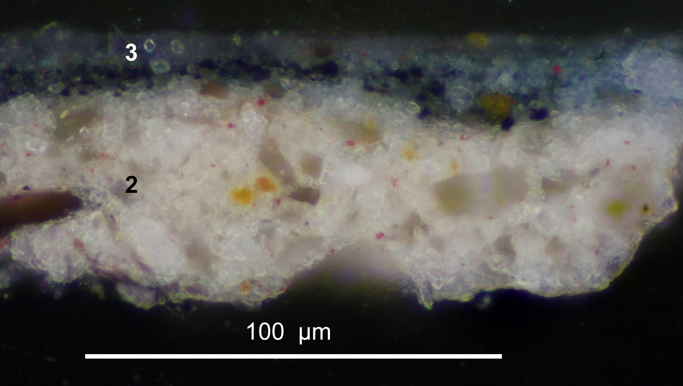
of Hamilton Kerr Institute.ExpandFig. 8At Hampstead Looking towards Harrow
magnified paint sample viewed in cross-section
showing: 2. pale pink ground layer; 3. thin paint
layer applied wet-in-wet onto the dry ground layer.
Fitzwilliam Museum, Cambridge PD79-1959. Digital image
courtesy of Hamilton Kerr Institute.
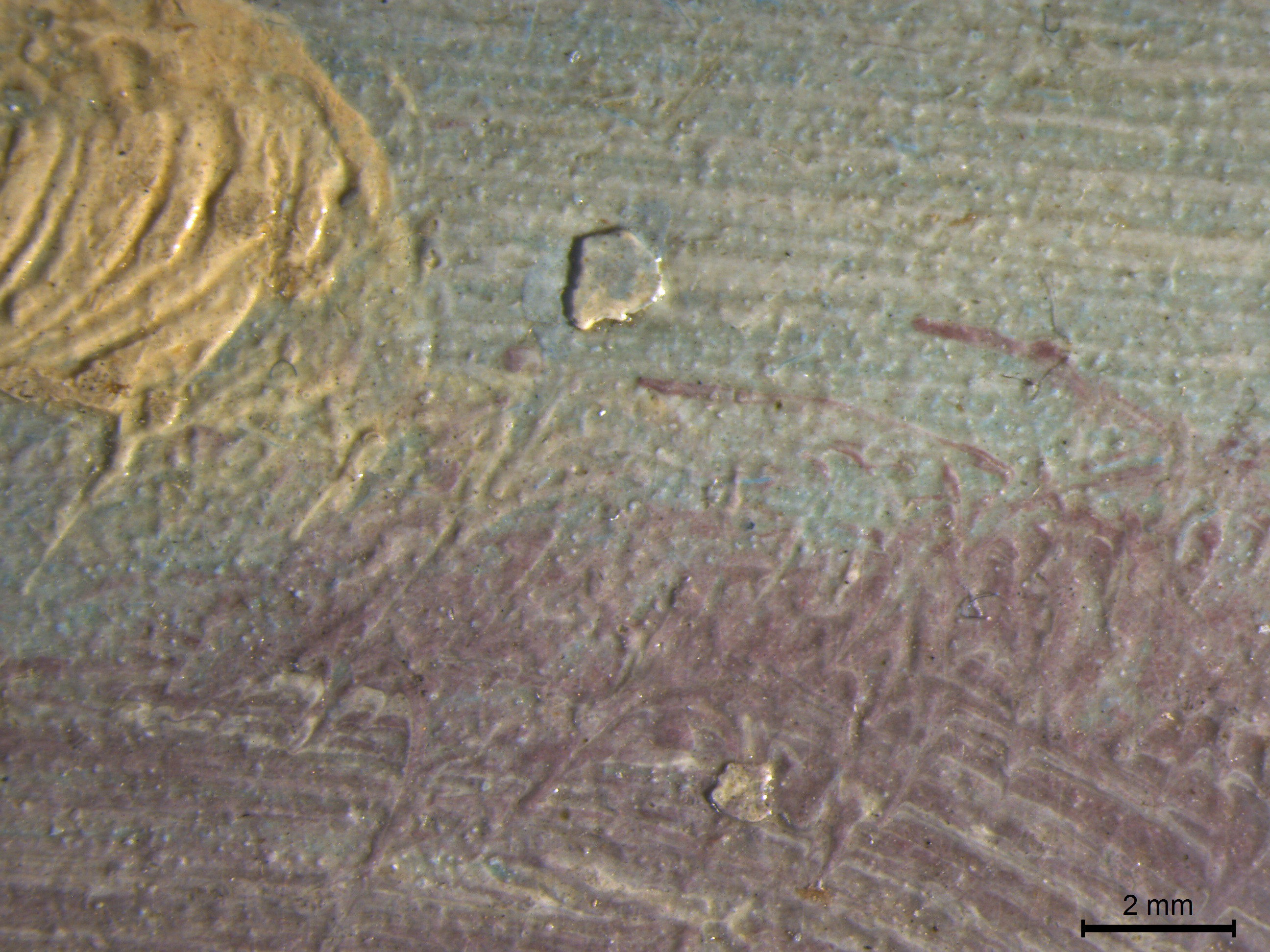
ExpandFig. 9At Hampstead Looking towards Harrow detail
and micrographs showing two small pinholes along the
bottom edge of the original support of
At Hampstead where it meets a strip added
later to the composition. Fitzwilliam Museum,
Cambridge PD79-1959. Digital image courtesy of
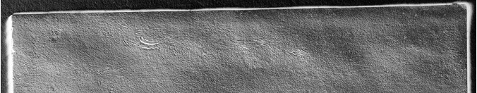
Hamilton Kerr Institute.ExpandFig. 10Sky Study with a Shaft of Sunlight raking
light detail showing three pinholes across the top
edge, and a circular indentation around the central
pinhole indicative of a pushpin. Fitzwilliam Museum,
Cambridge PD.222-1961. Digital image courtesy of Adele
Wright and Hamilton Kerr Institute.ExpandFig. 11Sky Study, Sunset digitally combined raking
light details showing a faint circular indentation
reminiscent of that made by the outer edges of a
pushpin. Fitzwilliam Museum, Cambridge PD.7-1961.
Digital image courtesy of Hamilton Kerr
Institute.
ExpandFig. 12Sky Study, Sunset micrograph of a squashed
impasto. Fitzwilliam Museum, Cambridge PD.7-1961.
Digital image courtesy of Hamilton Kerr
Institute.ExpandFig. 13Sky Study with a Shaft of Sunlight
micrograph of a squashed impasto. Fitzwilliam Museum,
Cambridge PD.222-1961. Digital image courtesy of Adele
Wright, Hamilton Kerr Institute.
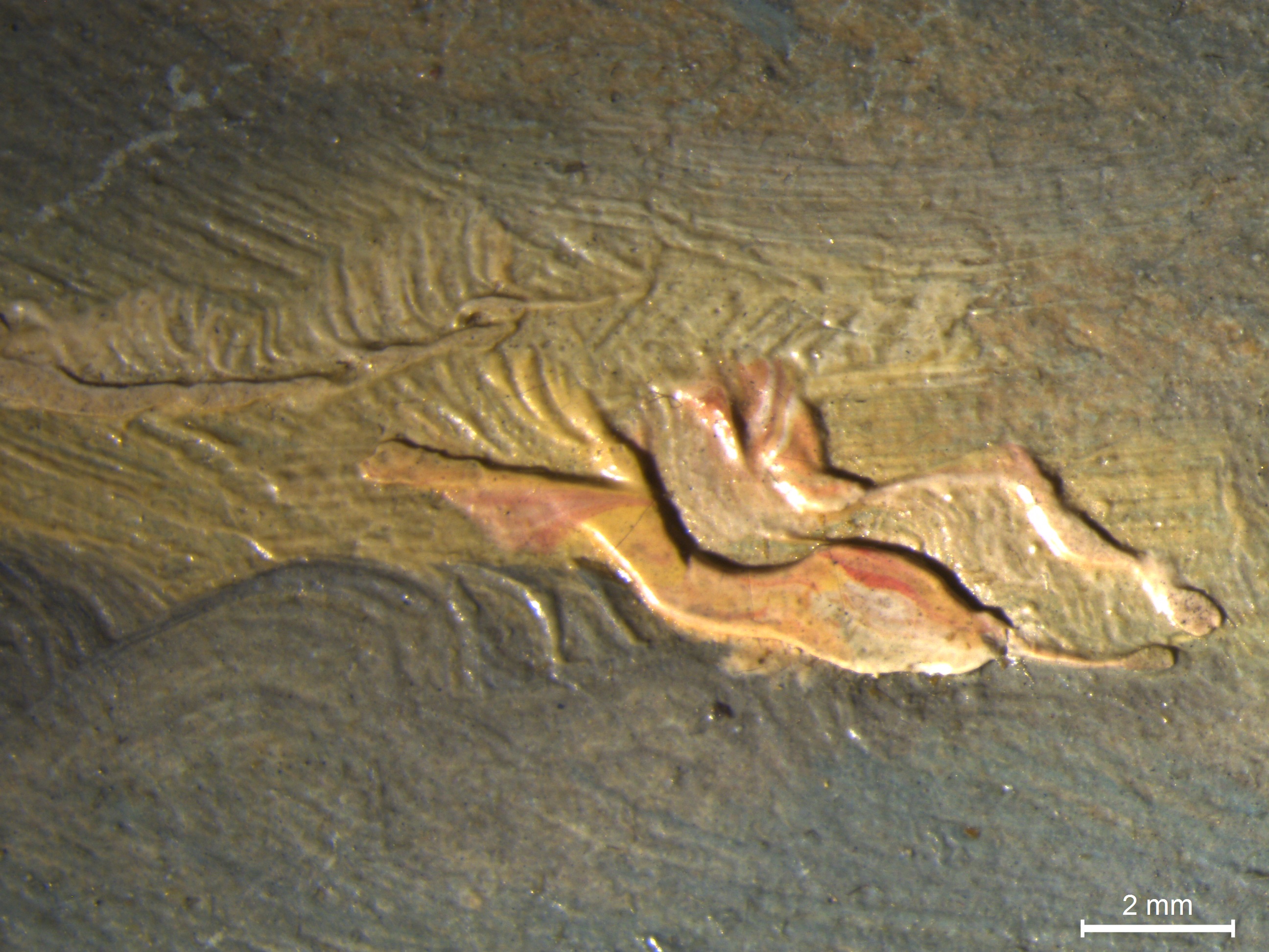
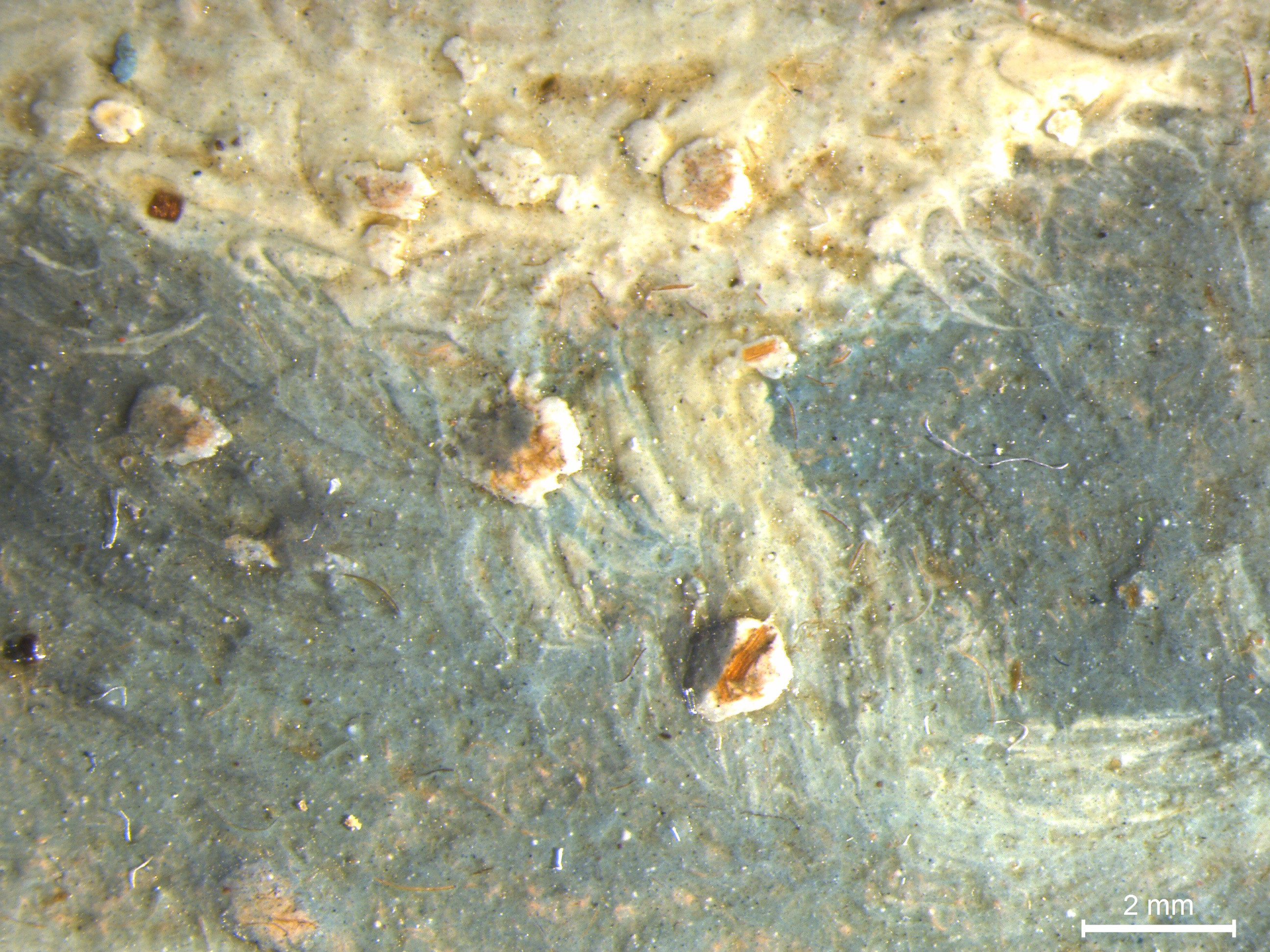
ExpandFig. 14Sky Study with Mauve Clouds micrograph
showing a fragment of a dried paint caught in the
paint layer. Fitzwilliam Museum, Cambridge PD.8-1951.
Digital image courtesy of Hamilton Kerr
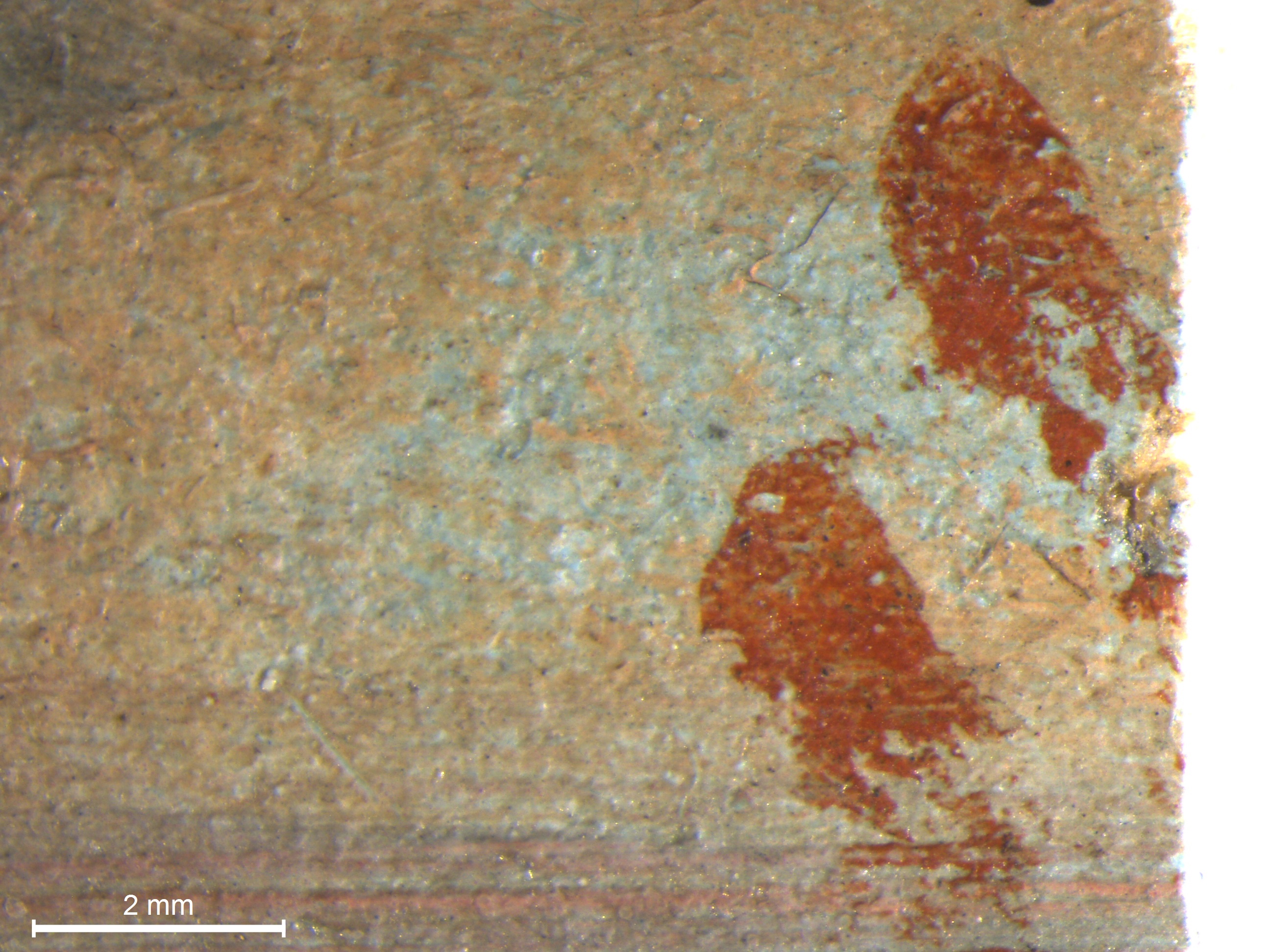
Institute.ExpandFig. 15Sky Study, Sunset micrograph showing
seemingly accidental red paint applied at the time of
execution of the sketch in the bottom right corner.
Fitzwilliam Museum, Cambridge PD.7-1961). Digital
image courtesy of Hamilton Kerr Institute.ExpandFig. 16At Hampstead Looking towards Harrow
micrograph showing wood fibres and dried paint caught
in the paint layers. Fitzwilliam Museum, Cambridge
PD79-1959. Digital image courtesy of Hamilton Kerr
Institute.
Studio Preparation for Skying
To understand Constable’s practice, Conal Shields has proposed
that it is vital to pay “close attention to Constable’s
handling” as it provides “direct indicators of what was
passing through the artist’s mind, what was emotionally
significant.”62
But simply observing the results of an artist’s handling is
not the only route to such understanding. Indeed, Constable
himself may well have urged a more practical mode of
investigation: for example, he sought to copy Claude rather
than just observe his paintings, because “doing it [would]
almost bring [him] into communion with Claude himself.”63
It was in the spirit of such a mode of inquiry that I tried to
reconstruct something close to what Constable called “skying.”
The exercise did not aim to copy Constable’s work, nor did I
aim to paint like Constable, but Constable’s materials and
processes were emulated closely in order to see whether an
experience of these could throw light on the quality and
nature of Constable’s attention.
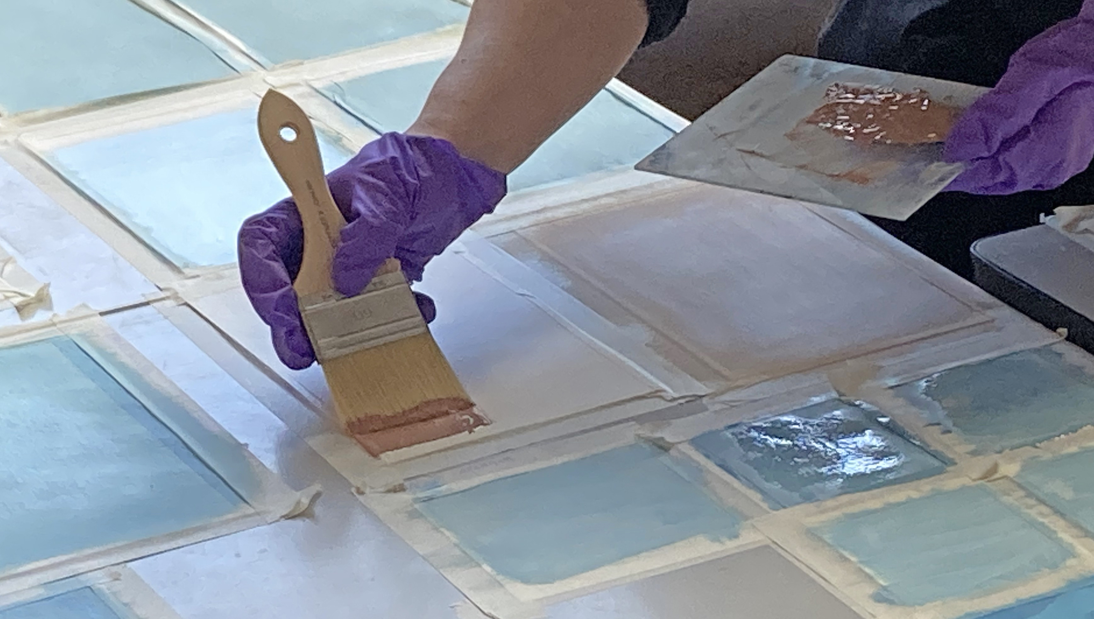
The first step was to prepare some laminated supports. Pasting
together full sheets of thin paper and preparing them with
grounds before cutting, as Constable did, would have been the
most efficient way to prepare multiple laminated supports at
once,64
but in the interest of experimenting with different
combinations, I cut large paper sheets to the size I wished to
use before laminating them together in a variety of
combinations, and with various kinds of size and coloured
grounds. I used a range of papers of differing weights,
qualities, and surfaces in order to imitate the sort of
selection processes an artist of the early nineteenth century
may have carried out (albeit with modern equivalents of
papers).65
Until papers were produced specifically for oil painting in
the mid-nineteenth century,66
artists had to use papers manufactured for other purposes.67
Constable used a great range of papers for oil sketching,
frequently including low-quality papers, apparently often
whatever happened to be at hand;68
consistency, quality, and colour may not have mattered to him
for informal sketches, especially once hidden by pigmented
grounds and paint layers.69
I created a range of pasteboards of differing compositions and
ply using different papers, and using the various glues that
would have been available to Constable: animal glue, gelatine
glue, starch paste, or vegetable gum.70
There is little information in artists’ manuals about
preparing paper supports for oils,71
but artists may have adapted instructions for other types of
painting, such as gouache.72
Constant de Massoul, for example, recommended pasting paper
onto a wooden board for gouache using starch or flour paste
mixed with hide glue.73
The single sheets and prepared laminates were then sized in a
number of different ways—with rabbit-skin glue, gelatine,
starch paste, or isinglass—with some left unsized (Fig. 17).
An artist working on paper or card in the eighteenth or
nineteenth century may have sized their paper supports with
various kinds of glue before applying a ground layer to stop
the support from being excessively absorbent. Alternatively,
sizing by the artist may not have been necessary if papers in
the laminate had already been heavily sized by the
manufacturer.74
ExpandFig. 18Paint for the ground layer was prepared with various
combinations of pigments and mediums and was applied by
brush to the laminated paper mock-ups.
The final step in preparing the kinds of mocked-up supports
Constable used was to apply various colours of grounds in
different binding mediums to the prepared papers and paper
laminates (Fig. 18). I prepared grounds matching those that
have been identified on Constable’s sky sketches75—pinks, buffs, browns, and blues—two of which (blue and pink)
can also be found on the sky sketches in the Fitzwilliam’s
collection.76
I applied some grounds bound in oil and some in glue to see
how they compared. Analysis has suggested that Constable
switched from using aqueous grounds to oil grounds in the
1820s, but it has remained unclear why he would have made this
change to his practice.77
I found that the glue-bound grounds dried much faster, but the
drying time of the ground may not have mattered to an artist
preparing a batch of supports well in advance of a sketching
trip. Oil grounds were best applied as pigment-rich, lean
mixtures; any excess oil medium was not absorbed by the
support and sat on top of the ground as a shiny, extremely
slow-drying layer. In fact, it was surprising to find how
little oil all the papers could absorb, regardless of how they
were sized.
ExpandFig. 19Using the same pigment mixture in the same medium,
different effects resulted in ground layers depending on
the support to which the paint was applied.
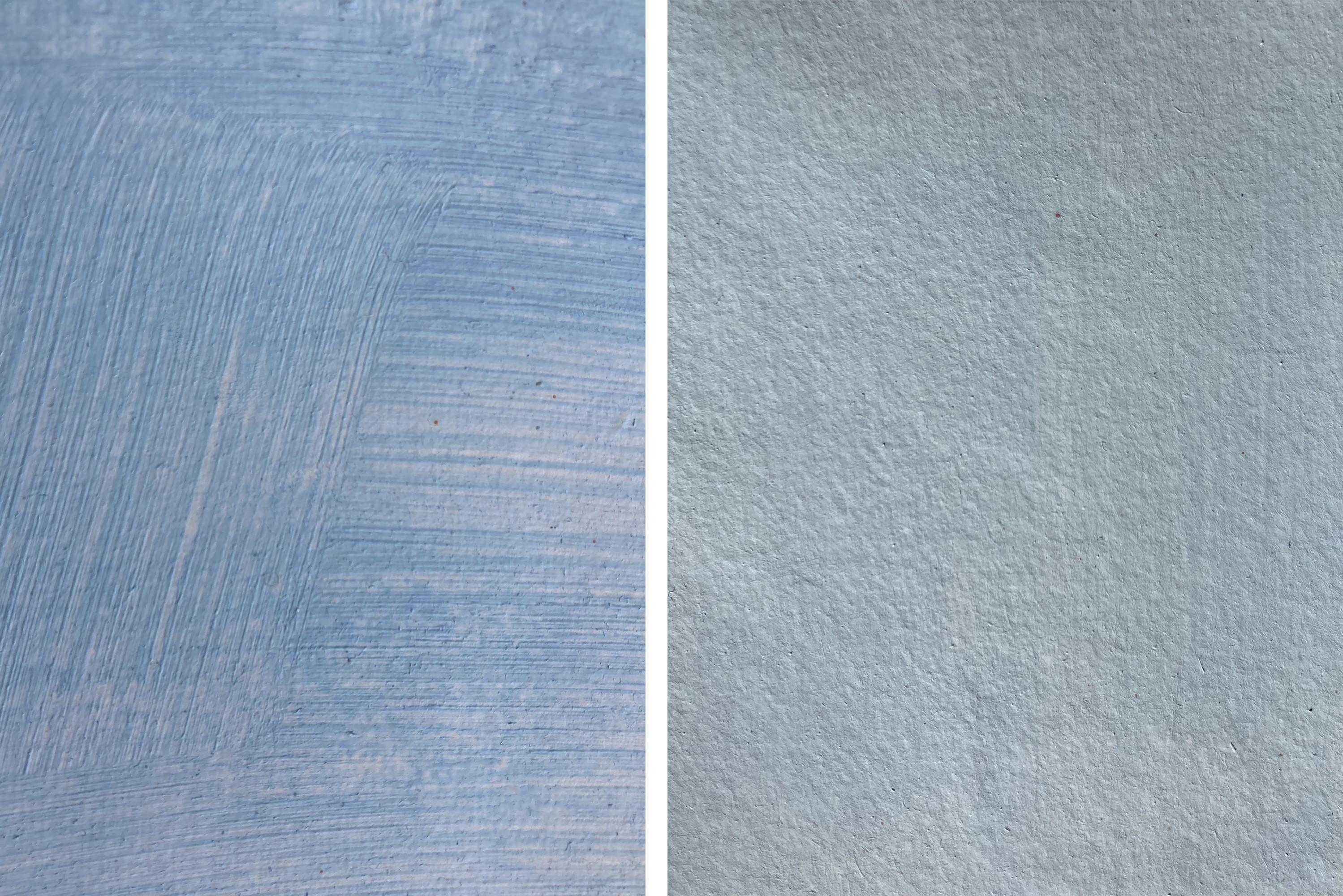
The same method of brush application was used on all the
mock-ups; however, some ground layers were streaky, and others
laid on smoothly with no brushmarks (Fig. 19). The streakiness
of the grounds depended on the type of paper and size to which
the grounds were applied. The grounds that dried with no
brushstrokes were applied onto the lightly sized, slightly
absorbent supports. Streaky grounds resulted when the same
ground was applied to heavily sized papers, especially those
that had been tub sized rather than internally sized by the
manufacturer.78
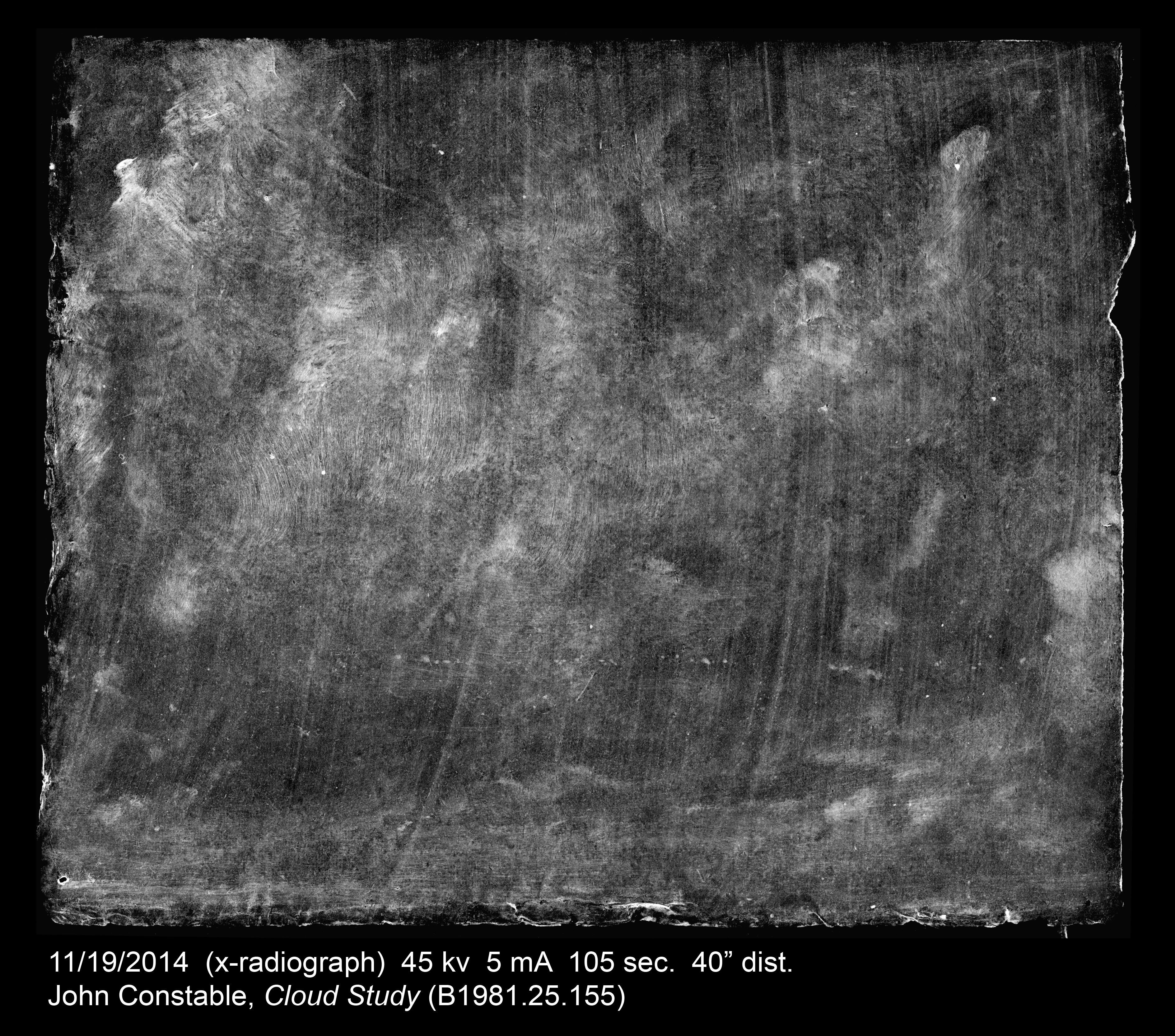
The streakiness of Constable’s grounds has been found to vary:
sometimes they are thin and settled into the texture of the
paper fibres, giving a slightly mottled effect that is similar
to those found on the Fitzwilliam’s sketches; sometimes they
are streaky or retain brushstrokes as can be seen, for
example, in Cloud Study: Stratocumulus Cloud (Yale
Center for British Art, B1981.25.155). As the ground paint
layer tends to include lead white and barium, the streakiness
of the ground is apparent in X-radiographs (Figs. 20, 21).
Cove has suggested that this difference indicates his altering
the medium he used for ground layers,79
but from these experiments, it seems that it might also be
related to the variety of kinds of supports Constable made use
of.
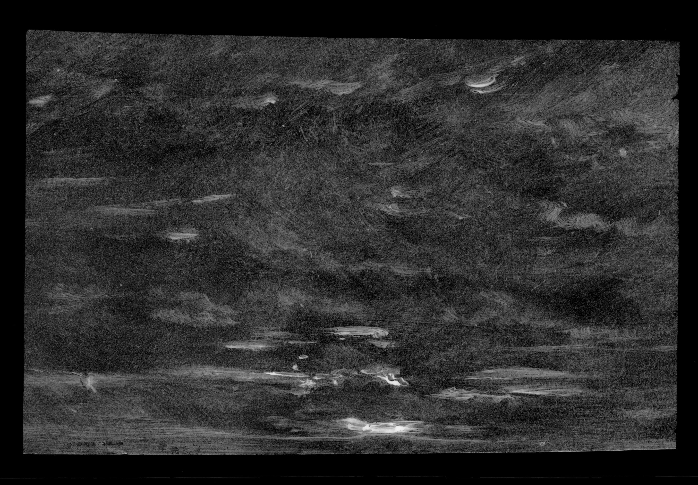
ExpandFig. 20Sky Study, Sunset X-radiograph showing no
visible brushmarks in the ground layer. Fitzwilliam
Museum, Cambridge PD.7-1961. Digital image courtesy of
Chris Titmus, Hamilton Kerr Institute.ExpandFig. 21John Constable,
Cloud Study: Stratocumulus Cloud X-radiograph
showing streaky brushmarks in the ground layer, oil on
paper laid on board, 24.8 x 30.2 cm. Yale Center for
British Art, New Haven B1981.25.155. Digital image
courtesy of Yale Center for British Art.
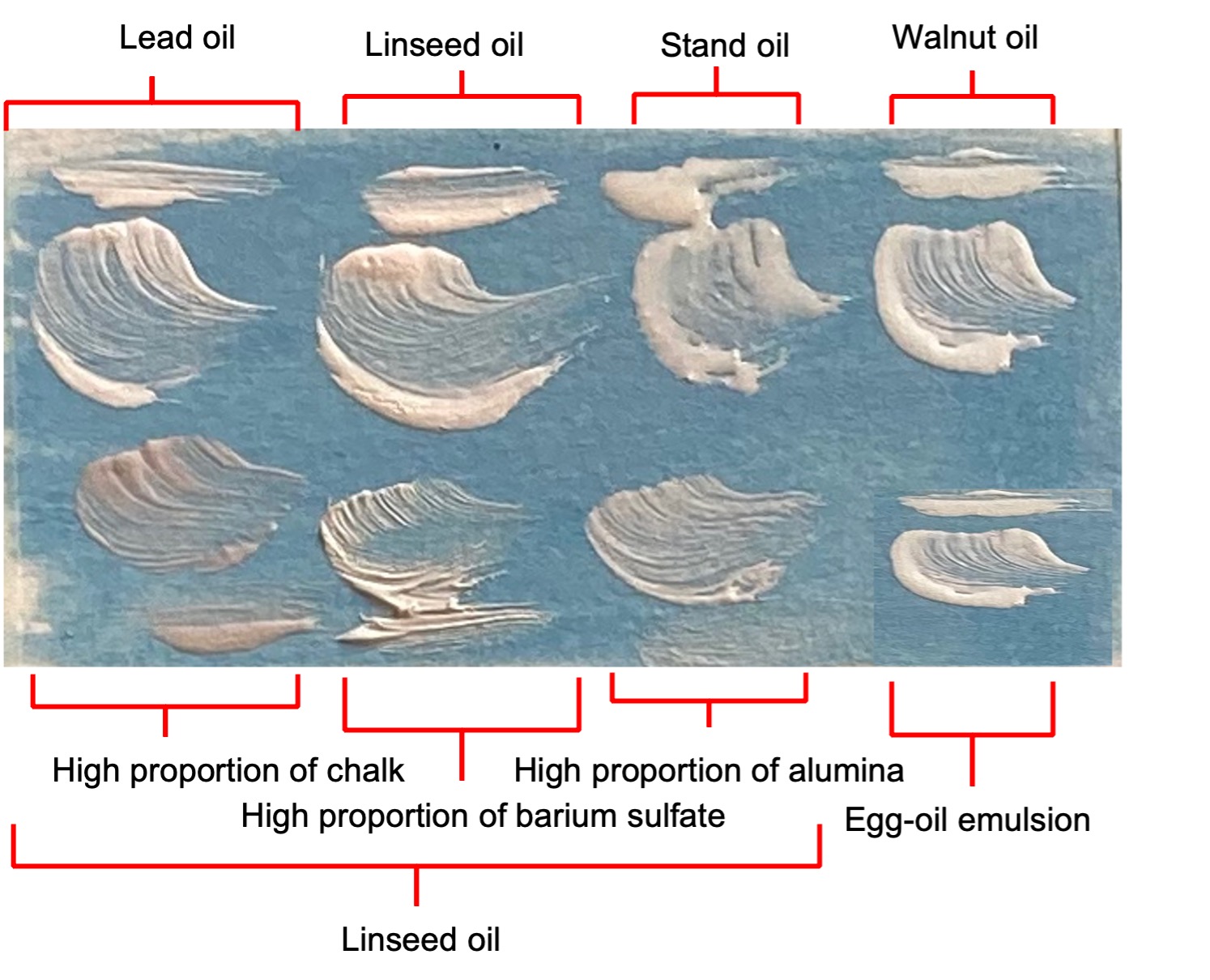
Paints were prepared by grinding pigments into oil with a
muller and slab, and I tested out various mediums in the
studio. Presumably a fast-drying medium would be advantageous
to the plein-air sketcher, as, for instance, Constable’s
methods required his sketches to be touch dry within an hour
so that he could pack and transport them.80
While for his earliest sketches Constable employed linseed and
walnut oil,81
he began to use faster-drying heat-bodied oil for dark
areas,82
and a linseed oil and egg mixture from 1811 or 1812.83
Cove’s tests of oil-egg binders found them to be touch dry
within an hour;84
I found that while using faster-drying mediums (such as lead
oil or egg-oil mixtures) did help paint dry a little faster
than slower-drying mediums (such as walnut oil), adjusting the
proportions of pigment to oil seemed to have a greater effect
on drying. An extremely leanly bound paint was necessary to
approach a conveniently fast drying time with even the
faster-drying mediums.85
This may explain why samples taken from the Fitzwilliam
sketches showed leanly bound paint layers, and Constable’s oil
sketches that remain unvarnished tend to have a lean, chalky
appearance.86
While egg in combination with oil aided drying, its downside
was a tendency to mould, necessitating more time spent
preparing fresh paint more frequently. For this reason, I
opted for pigments bound in linseed oil for my own sky
sketching.
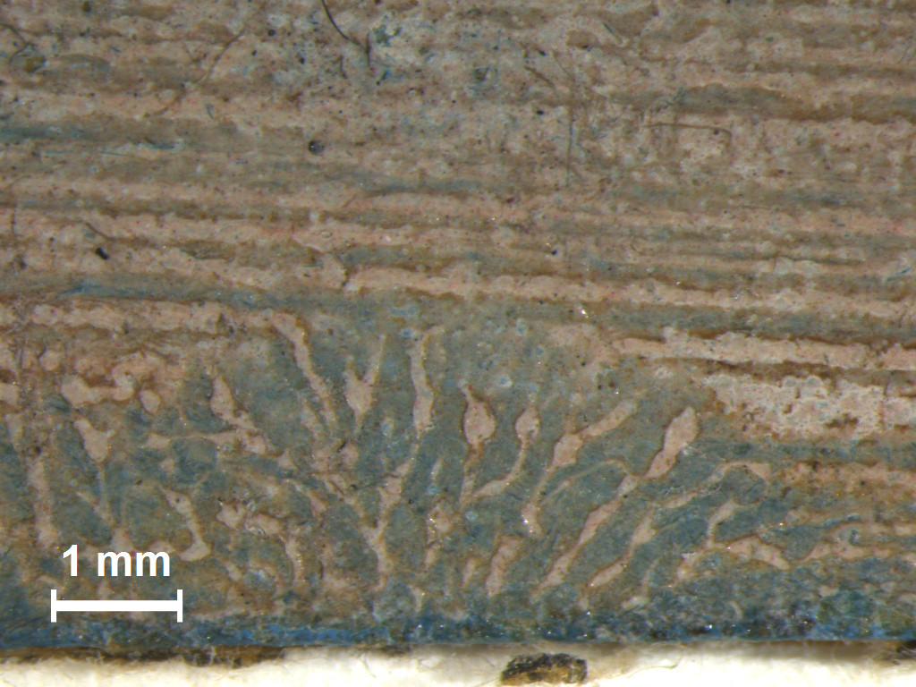
Pigments bound very leanly in oil could effectively re-create
the sort of range of effects seen on Constable’s sky sketches,
and on the Fitzwilliam’s sky studies—from very thin, smooth
layers to stiff, crisp impasto highlights. However, it was
difficult to re-create the translucency of some of the layers
while using a paint that remained lean without adding
significant amounts of translucent extenders to pigment
mixtures.87
Adding significant amounts of barium sulfate and chalk to the
paint—up to 50%—and using a stiff brush, made it possible to
create the effects observed in Constable’s sketches where thin
layers of paint retain brushmarks and allow the ground layer
to show beneath (Figs. 22–24). It is perhaps interesting to
note that barium and calcium are detectable within paint
layers of the Fitzwilliam sketches, and Constable’s paints are
found to frequently contain considerable amounts of
translucent extenders.88
It has been suggested that he used these to manipulate the
transparency of his paints.89
Extenders may have helped him to achieve translucent
glaze-like effects without using traditional glazing
techniques, which dry slowly due to being medium-rich. Not
only did the extenders add translucency to paints, but they
also allowed lower layers to show through by way of the
consistency they lent to paint.
ExpandFig. 22Sky Study with Mauve Clouds micrograph
showing the blue ground layer visible through
interstices in the opaque paint layer caused by the
retention of brushmarks. Fitzwilliam Museum, Cambridge
PD.8-1951. Digital image courtesy of Hamilton Kerr
Institute.ExpandFig. 23John Constable,
Sky Study with a Shaft of Sunlight micrograph
showing the blue ground layer visible through
interstices in the opaque paint layer caused by the
retention of brushmarks and a fingerprint. Fitzwilliam
Museum, Cambridge PD.222-1961. Digital image courtesy
of Adele Wright, Hamilton Kerr Institute.ExpandFig. 24Mock-ups of lead white paint with different mediums
and different extenders showing the effect of medium
and extenders on the retention and texture of
brushmarks.
Skying
I used the prepared supports and paints to re-create the
process of sky sketching: I sketched some skyscapes out of a
window, as Constable is known to have done occasionally,90
and completed a number of others outdoors. De Piles describes
plein-air sketchers taking with them “a flat box, which
commodiously held their pallet, pencils, oil, and
colours,”91
so I used something similar, carrying the minimum number of
tools and pigments needed. I also used the lid of the box to
support my sketches while painting, as Constable described
himself doing in a letter to John Fisher on 5 January 1825:
“they were done in the lid of my box on my knees as
usual.”92
While sketching from a window of a controlled studio
environment, I used the pigments and extenders Constable is
known to have used for his own sketches: lead white, Prussian
blue, Naples yellow, lakes, carbon black, vermilion, chalk,
and barium sulfate.93
For health and safety reasons, I substituted the palette with
close equivalents for sketching outdoors in public
areas—Prussian blue, titanium white, chrome yellow, yellow
ochre, red and yellow lakes, carbon black, iron oxide red,
barium sulfate, and chalk—but still prepared the paints by
grinding the pigments in oil by hand.94
I also used a tube of Gamblin lead-white replacement,95
finding that it effectively re-created the viscosity of
lead-white oil paint, and was therefore a better substitution
than hand-prepared titanium white in oil. Painting indoors was
convenient, as the number of tools was unrestricted, but
painting outdoors had the pleasing advantage of allowing me to
freely select which portion of sky to paint, unrestricted and
undictated by a window frame.
Outdoors, I found it possible to sketch with very few
implements and materials. One brush, either round or flat, was
sufficient to create a range of marks, and very small amounts
of paint were needed for each sketch. It was useful to examine
the Fitzwilliam sketches, and attempt to re-create the kinds
of effects seen on them in preparation for my own skying, as
it quickly led to an appreciation of how little paint was used
to create such images, and how precisely placed each
brushstroke was without any working over; when I applied
multiple brushstrokes on top of each other, the effect became
less and less like those observed. When sketching in this way,
I found that batches of prepared paint stored in glass vials
or in mock polyethylene “bladders” lasted for weeks,96
so although preparing them from powder was time-consuming, the
effort did not need to be repeated.
All of the laminated papers and single sheets that had been
prepared proved perfectly suitable to paint on with oils.
However, the glue-bound grounds felt different to paint on
compared to the oil-bound grounds. Paint was difficult to
brush over the surface of the glue grounds, until I learned to
thin them sufficiently with diluent and became more used to
the fact that colours changed more as they “sank” and dried on
the glue grounds. Papers with gelatine-bound grounds caused
oil to spread out from brushmarks creating unpleasant-looking
tide marks. However, once I discarded these particular
supports and became more experienced with the glue grounds, I
could begin to make use of their inherent advantages. For
instance, as the paints dried more quickly over them, it was
possible to layer brushstrokes over the top and, if sufficient
extenders were added to upper layers, to play with layering
effects. This advantage is hinted at by de Piles when he
discusses painters using oils on paper: “the colours sinking,
they could put colour on colour, tho’ different from each
other.”97
The pre-coloured grounds alleviated some of the challenges of
painting skyscapes at necessary speed. I found the blue
grounds particularly helpful towards sketching skyscapes
quickly, with no need to spend time filling in the sky (video
1). However, I found it particularly difficult on the pink,
brown, and buff grounds to re-create the obvious difference
between sky and cloud seen in reality (video 2). No areas of
my sketches seemed to re-create anywhere near the luminosity
of the sky, or subtle gradations of shade in the clouds. With
this in mind, it was certainly reassuring to be reminded that
Constable described all great landscape masters as doomed to
consider their
best efforts but as experiments, and perhaps as experiments
that had failed when compared with their hopes, their
wishes, and with what they saw in nature. When we speak of
the perfection of art, we must recollect what the materials
are with which a painter contends with nature. For the light
of the sun he has but patent yellow and white lead—for the
darkest shade, umber or soot.98
On the topic of experimentation, it is worth noting that
although testing a range of papers, sizing glues, and grounds
was useful for seeing how they compared, each support selected
from the range I had prepared required some getting used to
while having to experiment also with pigment mixtures, paint
thickness, and brush pressure to try to capture the skyscape
before me. It has been pointed out with regard to landscape
sketches of the eighteenth and nineteenth centuries that the
informality of materials invited experimentation.99
Nevertheless, some sort of baseline consistency in method,
some controls in these experiments, seemed necessary.
ExpandVideo 2The pre-coloured grounds, particularly the blue grounds,
made it possible to sketch quickly enough to capture the
cloudscapes before they changed substantially.
ExpandVideo 3The luminosity and depth of the sky was challenging to
represent in paint.
With this in mind, it is perhaps unsurprising that the kinds
of paper surfaces artists used have been found to be
fairly consistent, where their entire oeuvres of works on
paper have been studied, despite the fact that they may have
used a range of papers.100
Artists in the late eighteenth or early nineteenth centuries
would have found difficulty in repeatedly sourcing the same
type of paper, and it is unlikely that artists at the turn of
the eighteenth century would have been able to select a
consistent paper by its name; the terminology of board types
and paper finishes was very blurred.101
Also, local and regional variations in the preparation of rags
for papermaking, and in papermaking practice, meant that a
rich variety of qualities of papers and boards was always
available to artists; for example, a “Not” (meaning not
hot-pressed) surface from one mill might look like a “rough”
surface from another.102
However, through experience working with a range of papers, an
artist probably came to understand a paper’s capabilities and
to select a consistent surface through handling it.103
Beyond the material and methodological challenges, the actual
act of painting the sky was extremely challenging; knowing
where to look and what to focus on when trying to capture the
unbounded space of constantly changing light, colour, and
cloud in static, two-dimensional, material form was remarkably
hard. Perhaps this should not have been surprising, given that
for centuries experienced artists have declared the subject a
demanding one.104
To begin with, I struggled to spend more than twenty minutes
on my sky sketches; this was not because I was satisfied with
my sketch after that time, but because the clouds I had set
out to paint had already changed, and I did not have the
necessary visual memory or imagination to complete what I had
set out to do.
Often, even before the clouds substantively moved or morphed,
by concentrating for a moment on mixing and diluting my
paints, I “lost my place” in the expanse of sky and forgot
which portion of it I had set out to paint in the first place.
Moreover, it was easy to fall into the tendency to try to
“freeze” the skyscape onto paper, and then become frustrated
when that skyscape inevitably changed. Accordingly, adaptation
and flexibility were crucial: Constable seems to have had this
in mind when he noted that “it is the business of a painter
not to contend with nature . . . but to make something out of
nothing.”105
In all likelihood, as Cove has pointed out, having observed
clouds forming and changing so often, Constable may have been
able to continue to add detail from memory, from an experience
of what “looked right,” and to anticipate the movement and
development of the scene before him.106
In contrast, my first attempts at sketches were completed in a
state of heightened panic induced by the speed with which
clouds move and the comparative slowness of my ability to
transcribe them in some sort of representation in paint (video
3).
ExpandVideo 4A pause to mix colours was long enough for the skyscape
to change completely.
As a result, I found much of my attention to be overly
absorbed by the handling of the materials and by focusing
almost too closely on the clouds. In particular, it was easy
to find myself suddenly overfocusing on a single aspect of the
sky—for instance, a certain shade or shadow—before panicking
to catch up with the rest of the scene and make sense of it,
thereby losing my bearings with regard to the paint, the
painting, and the skyscape. Michael Polanyi’s observation that
our conception of a comprehensive entity can be destroyed by
over-scrutinising its particulars—“an unbridled lucidity can
destroy our understanding of complex matters”107—appears to describe my experience in this regard. Trying to
pay attention to the clouds as I was painting led to a sort of
strained overfocus, certainly not the calm manner in which
Joshua Reynolds envisaged Constable painting outdoors—“in a
state of heightened consciousness, rapt in a species of
hypnotic vision.”108
Simply put, the more I sought to concentrate, the more
distracted I was (video 4).
ExpandVideo 5Attempting to get the right shade of the sky’s blue, or
of the shadow beneath a bank of cloud on the horizon,
meant rushing to capture the rest of the clouds after they
had already disappeared.
Over time, however, through practice and repetition, the
situation improved. I gravitated towards the supports I found
easiest to use and gradually found that I needed to expend
less conscious effort while mixing and applying the paints. I
became better able to respond to the properties of the
support, to modulate the pressure of the brush and the
viscosity and opacity of the paint, and to predict their
effects and the way the tones and texture would appear upon
drying. In this regard, some degree of tacit knowledge was
developed, a sensory knowledge that went beyond conscious
intention. Furthermore, I started to realise the benefits of
what can be described, following Milner, as “wide-angled
attention”:109
a more receptive and softer focus on the sky and the sketch in
progress. To cultivate such a form of attention took practice
and appeared to both generate and depend upon developing more
confident handling of the sketching materials.
To use slightly different language, then: rather than
focus on the sky, it was important to develop a
certain degree of sympathy with it. According to Lars
Spuybroek, who draws on the work of the American Pragmatist
William James, sympathy is a practice requiring a form of
knowledge between intelligence and instinct; a non-discursive,
nonanalytical intelligence acquired from skilled work,110
such as, we might say, sketching. This language certainly
resonates with wider Romantic thought: to take one notable
example, Johann von Goethe (1749–1832) is said to have
believed in the capacity of natural phenomena to respond to
human feeling, which became known as “the objective
correlative.”111
Relevant for the enquiry here is the fact that Carl Gustave
Carus (1789–1869)—scientist, artist, and acquaintance of
Goethe—felt the sky the primary vehicle for the objective
correlative;112
the particular nature of clouds, which lack a precise
definition, means that they are “felt before they are seen or
understood.”113
With the development of this sympathy, the process of sky
sketching became increasingly pleasurable—as we can suspect a
painter like Constable may have found it. The more I practiced
attending to the sky, the more I noticed the sky around me,
both in the act of sketching, and beyond that act as well. The
problem of capturing it on paper was both rewarding and
challenging enough to hold my interest; sketching it with any
success was always just sufficiently out of reach, which gave
the practice a certain addictiveness. Moreover, the
frustrations and satisfactions of the increased congruence
between my aims, my skill in handling the painting materials,
and the sky itself—leading towards that state of
all-encompassing “wide-angled” attention114—provided a potential link to understanding why it
is possible to find pleasure in such an activity.
Milner wrote of the “feeling of delight” that comes from the
dissolution of separation between subject and object as a
result of a particular state of attention,115
and this chimes with my experience of sky sketching. Given
that this process also appears to rely on, and generate, the
aforementioned tacit knowledge, it appears worth noting
Hazlitt’s proposal that “knowledge is pleasure as well as
power.”116
Milner perhaps took this same suggestion just a little further
in stating that the knowledge gained through one’s own
experience is the sort that is truly needed if one is to “live
at all, in any real sense.”117
Conclusion
This article has explored the benefits of combining an
analytical approach with an experiential one. Using the
language of attention, the first section outlined the
materials and methods used in Constable’s skying. The second
and third sections then traced the process of reconstructing
the broader activity of skying. Re-creating and experiencing
the approximate process of sky sketching was beneficial in
revealing Constable’s otherwise hidden knowledge. In
particular, the experience enabled further appreciation for
the skill an artist like Constable must have had in handling a
non-standardised range of papers, whose differing qualities
affect the characteristics of ground layers and the handling
of the paint. Moreover, such an activity also seemed valuable
to begin to experience and understand the qualities of
attention necessary for sky sketching, and the possible
relationships between attention and pleasure. This sensory
method of exploration seems particularly apt when considering
artworks produced in, and inspired by, an age that put such
value on the senses, feeling, and emotion as means of
insight.118
Accordingly, attention and pleasure have been this article’s
subject and its method. It has sought to build upon and extend
Shields’s proposal that it is vital to pay “close attention to
Constable’s handling”119
by paying attention to what a painter like Constable might
have paid attention to. It has explored the extent to which it
is possible to discuss the “materiality” of attention and
pleasure. In this regard, therefore, and somewhat like a sky
sketch, it is both a record of an experiment and a type of
experiment itself.
Acknowledgements
I would like to warmly thank Adèle Wright and Spike Bucklow
(University of Cambridge) for feedback on drafts; Sarah Cove
for very helpful advice on reconstructions and information
about Constable’s materials; Richard Farleigh (University of
Cambridge) for his kind advice on examining the Fitzwilliam
Museum sky sketches; Chris Titmus for advice on photography
and for taking X-radiographs; Lucy Wrapson and Iris Buisman
(University of Cambridge) for conducting the SEM-EDX analysis
on cross-section samples; Nicholas Robbins (University College
London) for useful suggestions; and Jane Munro and colleagues
at the Fitzwilliam Museum for allowing me to examine the sky
sketches from the collection. I am also very grateful to the
Materia editorial team and two anonymous reviewers
for their feedback on this article.
Author Bio
Rowan Frame is a conservator at Julia Nagle Conservation Ltd.
She gained her PGDip in the conservation of easel paintings at
the Hamilton Kerr Institute, University of Cambridge, UK.
Beckett, Ronald Brymer.
John Constable’s Correspondence. Vol. 1,
The Family at East Bergholt, 1807–1837. London:
Historical Manuscripts Commission, Her Majesty’s Stationery
Office, 1962.
———. John Constable’s Correspondence. Vol. 3*, The
Correspondence with C. R. Leslie*, vol. 8. Ipswich: Suffolk
Records Society, 1965.
———. John Constable’s Correspondence. Vol. 6,
The Fishers, vol. 12. Ipswich: Suffolk Records
Society, 1968.
Bower, Peter.
Turner’s Papers: A Study of the Manufacture, Selection
and Use of His Drawing Papers, 1787–1820. London: Tate Gallery, 1990.
———.
A Brush with Nature: An Historical and Technical Analysis
of the Papers and Boards Used as Supports for Landscape
Oil Sketching. Works of Art on Paper: Books, Documents, and Photographs:
Techniques and Conservation 16. London: International
Institute for Conservation of Historic and Artistic Works,
2002.
———. “Careful and Considered Choice: Thomas Jones’s Use of
Paper.” In
Thomas Jones (1742–1803): An Artist Rediscovered,
edited by Ann Sumner and Greg Smith, 101–7. New Haven, CT:
Yale University Press, 2003.
———. “Catching the Sky: The Papers and Boards Used by John
Constable for His Studies of Sky and Cloud.” In
Constable’s Skies, edited by Frederic Bancroft,
153–80. New York: Salander-O’Reilly Galleries, 2004.
Burke, Edmund.
A philosophical enquiry into the origin of our ideas of
the sublime and beautiful: With an introductory discourse
concerning Taste; and several other Additions. 1759. Cambridge: Cambridge University Press, 2014.
Carlyle, Leslie.
The Artist’s Assistant: Oil Painting Instruction Manuals
and Handbooks in Britain, 1800–1900, with Reference to
Selected Eighteenth-Century Sources. London: Archetype, 2001.
Clarke, Michael. “The Bigger Picture: Landscape Sketches and
‘Finished’ Tableaux.” In
True to Nature: Open-Air Painting in Europe,
1780–1870,
edited by Ger Luitjen, Mary Morton, and Jane Munro, 19–30.
London: Paul Holberton, 2020.
Conisbee, Philip. “Pre-Romantic
Plein-Air Painting.” Art History 2, no. 4
(1979): 413–28.
Constable, Freda. “The Man of Clouds.” In
Constable’s Skies, edited by Frederic Bancroft,
13–18. New York: Salander-O’Reilly Galleries, 2004.
Cove, Sarah. “Constable’s Oil Painting Materials and
Techniques.” In Constable, 493–529. London: Tate
Gallery, 1991.
———. “‘Mixing and mingling’: John Constable’s Oil Paint
Mediums, c. 1802–37, Including the Analysis of the ‘Manton
Paint Box.’” In
Painting Techniques: History, Materials and Studio
Practice,
211–16. London: International Institute for Conservation of
Historic and Artistic Works, 1998.
———. “‘Very great difficulty in composition and execution’:
The Materials and Techniques of Constable’s Cloud and Sky
Studies of the 1820s.” In Constable’s Skies, edited
by Frederic Bancroft, 123–52. New York: Salander-O’Reilly
Galleries, 2004.
———. “‘Fit for purpose’: Constable’s Use of Millboard and
Paper for Oil Sketching, c. 1809–29.” In Constable’s Oil Sketches, 1809–29: The Maria Bicknell
Years, 115–41. New York: Salander-O’Reilly Galleries, 2007.
———. “‘Fit for purpose’: 30 Years of the Constable Research
Project.” In
Studying the European Visual Arts, 1800–1850: Paintings,
Sculpture, Interiors and Art on Paper, CATS Proceedings III, edited by Joyce H.
Townsend and Abbie Vandivere, 94–108. London: Archetype,
2016.
Eastaugh, Nicholas, Valentine Walsh, Tracey Chaplin, and
Ruth Siddall.
The Pigment Compendium: A Dictionary of Historical
Pigments.
Oxford: Elsevier, 2004.
Esmeijer, Ank C. “Cloudscapes in Theory and Practice.”
Simiolus: Netherlands Quarterly for the History of
Art
9, no. 3 (1977): 123–48.
Evans, Mark, Nicola Costaras, and Clare Richardson.
“Constable’s Sketches: Technical Observations.” In
John Constable: Oil Sketches from the Victoria and Albert
Museum,
145–57. London: V&A Publishing, 2011.
Evans, Mark.
Constable’s Skies: Paintings and Sketches by John
Constable. London: V&A Publishing, 2018.
Felfe, Robert. “Naer het leven: Between
Image-Generating Techniques and Aesthetic Mediation.” In
Ad Vivum? Visual Materials and the Vocabulary of
Life-Likeness in Europe before 1800, edited by Thomas Balfe, Joanna Woodall, and Claus Zittel,
44–88. Boston: Brill, 2019.
Gage, John. “Clouds over Europe.” In
Constable’s Clouds: Paintings and Cloud Studies by John
Constable,
edited by Edward Morris, 125–34. Edinburgh: National
Galleries Scotland and National Museums and Galleries on
Merseyside, 2000.
Galassi, Peter.
Before Photography: Painting and the Invention of
Photography.
New York: Museum of Modern Art, 1981.
Gilpin, William.
Three essays on picturesque beauty; on picturesque
travel; and on sketching landscape: to which is added a
poem, on landscape painting. London: R. Blamire, 1792.
Hawes, Louis. “Constable’s Sky Sketches.”
Journal of the Warburg and Courtauld Institutes 32
(1969): 344–65.
Hazlitt, William. “On Imitation.” In
Romantic Critical Essays, edited by David Bromwich,
92–96. Cambridge: Cambridge University Press, 1817.
Hoenigswald, Ann. “Making Their Mark: The Handling of Paint
in Plein Air Sketches.” In
True to Nature: Open-Air Painting in Europe,
1780–1870, edited by Ger Luitjen, Mary Morton, and Jane Munro,
31–42. London: Paul Holberton, 2020.
Leslie, Charles Robert.
Memoirs of the Life of John Constable, Esq. R.A. Composed
Chiefly of His Letters. 1845. 2nd ed. Cambridge: Cambridge University Press,
2013.
Luijten, Ger. “Skies and Effects.” In
True to Nature: Open-Air Painting in Europe,
1780–1870, edited by Ger Luitjen, Mary Morton, and Jane Munro,
151–76*.* London: Paul Holberton, 2020.
Lyles, Anne. “‘That immense canopy’: Studies of Sky and
Cloud by British Artists, c. 1770–1860.” In
Constable’s Clouds: Paintings and Cloud Studies by John
Constable, edited by Edward Morris, 135–50. Edinburgh: National
Galleries Scotland and National Museums and Galleries on
Merseyside, 2000.
———. “‘The glorious pageantry of heaven’: An Assessment of
the Motives behind Constable’s ‘Skying.’” In
Constable’s Skies, edited by Frederic Bancroft,
29–56. New York: Salander-O’Reilly Galleries, 2004.
Massoul, M. Constant de.
A treatise of the art of painting and the composition of
colours containing instructions for all the various
processes of painting; together with observations upon the
qualities and ingredients of colours.
Translated from the French of M. Constant de Massoul.
London: printed by the author, 1797.
Miller, Asher Ethan. “The Path of Nature: French Paintings
from the Wheelock Whitney Collection, 1785–1850.”
Metropolitan Museum of Art Bulletin 70, no. 3
(Winter 2013): 4–43.
Milner, Marion. On Not Being Able to Paint. 2nd
edition. Melbourne: William Heinemann, 1957.
Morris, Edward, ed.
Constable’s Clouds: Paintings and Cloud Studies by John
Constable. Edinburgh: National Galleries Scotland and National
Museums and Galleries on Merseyside, 2000.
Morton, Mary, Jane Munro, and Ger Luijten. Introduction to
True to Nature: Open-Air Painting in Europe,
1780–1870,
edited by Luitjen, Morton, and Munro, 11–19. London: Paul
Holberton, 2020.
Parris, Leslie, and Ian Fleming-Williams.
Constable. London: Tate Gallery, 1991.
Parris, Leslie, Ian Fleming-Williams, and Conal Shields,
eds.
John Constable: Further Documents and Correspondence. London: Tate and Suffolk Records Society, 1975.
Phillips, Adam. Introduction to Marion Milner,
The Hands of the Living God, xviii–xxxv*.* 1969.
New York: Routledge, 2011.
———. Attention Seeking. London: Penguin Random
House, 2019.
Piles, Roger de. The Principles of Painting.
Translated “by a painter.” London: J. Osborn, 1743.
Polanyi, Michael. The Tacit Dimension. 1966.
Chicago: University of Chicago Press, 2009.
Radisich, Paula Rea. “Eighteenth-Century Plein-Air Painting
and the Sketches of Pierre Henri de Valenciennes.”
Art Bulletin 64, no. 1 (1982): 98–104.
Reynolds, Graham.
Constable: The Natural Painter. London: Cory, Adams
and Mackay, 1965.
———.
The Later Paintings and Drawings of John Constable.
New Haven, CT: Yale University Press, 1984.
Russell, David. “Tact in Psychoanalysis: Marion Milner.” In
Tact: Aesthetic Liberalism and the Essay Form in
Nineteenth Century Britain, 142–64. Princeton: Princeton University Press, 2018.
Shields, Conal. “Why Skies?” In Constable’s Skies,
edited by Frederic Bancroft, 111–23. New York:
Salander-O’Reilly Galleries, 2004.
Spuybroek, Lars. “Abstraction and Sympathy.” In
The Sympathy of Things: Ruskin and the Ecology of
Design, 107–56. Oxford: Routledge, 2016.
Thornes, John E. “Constable’s Meteorological Understanding
and His Painting of Skies.” In
Constable’s Clouds: Paintings and Cloud Studies by John
Constable, edited by Edward Morris, 151–60. Edinburgh: National
Galleries Scotland and National Museums and Galleries on
Merseyside, 2000.
van Loon, Annelies, Petra Noble, and Aviva Burnstock.
“Ageing and Deterioration of Traditional Oil and Tempera
Paints.” In Conservation of Easel Paintings, edited
by Joyce Hill Stoner and Rebecca Rushfield, 214–41. London:
Routledge, 2012.
Notes
For an account of early landscapes made from direct
observation, see Robert Felfe, “Naer het leven:
Between Image-Generating Techniques and Aesthetic
Mediation,” in
Ad Vivum? Visual Materials and the Vocabulary of
Life-Likeness in Europe before 1800,
ed. Thomas Balfe, Joanna Woodall, and Clause Zittel
(Boston: Brill, 2019), 58–59. For the growing momentum
of outdoor sketching in eighteenth- and
nineteenth-century Europe, see Asher Ethan Miller, “The
Path of Nature: French Paintings from the Wheelock
Whitney Collection 1785–1850,”
Metropolitan Museum of Art Bulletin 70, no. 3
(Winter 2013): 8.
↩︎
Peter Galassi,
Before Photography: Painting and the Invention of
Photography
(New York: Museum of Modern Art, 1981), 21.
↩︎
Paula Rea Radisich, “Eighteenth-Century Plein-Air
Painting and the Sketches of Pierre Henri de
Valenciennes,” Art Bulletin 64, no. 1 (1982):
98. ↩︎
John Gage, “Clouds over Europe,” in
Constable’s Clouds: Paintings and Cloud Studies by
John Constable, ed. Edward Morris (Edinburgh: National Galleries
Scotland and National Museums and Galleries on
Merseyside, 2000), 128.
↩︎
See Gage, 132–33; Ger Luijten, “Skies and Effects,” in
True to Nature: Open-Air Painting in Europe,
1780–1870,
ed. Luitjen, Mary Morton, and Jane Munro (London: Paul
Holberton, 2020), 161, 164; and Miller, “Path of
Nature,” 20.
↩︎
Louis Hawes, “Constable’s Sky Sketches,”
Journal of the Warburg and Courtauld Institutes
32 (1969): 344.
↩︎
For an estimate of the number of oil sketches of skies
completed by Constable, see Leslie Parris and Ian
Fleming-Williams, Constable (London: Tate
Gallery, 1991), 228. Consideration of Constable’s
motivations for sky sketching is found in, for example,
Hawes, “Constable’s Sky Sketches”; Anne Lyles, “‘The
glorious pageantry of heaven’: An Assessment of the
Motives behind Constable’s ‘Skying,’” in
Constables Skies, ed. Frederic Bancroft (New
York: Salander-O’Reilly Galleries, 2004), 29–56; John E.
Thornes, “Constable’s Meteorological Understanding and
His Painting of Skies,” in Morris,
Constable’s Clouds, 151–60; Mark Evans,
Constable’s Skies: Paintings and Sketches by John
Constable
(London: V&A Publishing, 2018), 11; and Conal
Shields, “Why Skies?,” in Bancroft,
Constable’s Skies, 111.
↩︎
For discussions of Constable’s engagement with
literature and theory, see Hawes, “Constable’s Sky
Sketches,” 361; and Leslie Parris, Ian Fleming-Williams,
and Conal Shields, eds.,
John Constable: Further Documents and
Correspondence
(London: Tate and Suffolk Records Society, 1975), 25. It
could be inferred that poetry influenced Constable’s sky
sketching as he quoted from Wordsworth’s 1811 poem—which
includes the lines “Praised be the Art whose subtile
power could stay / Yon cloud, and fix it in that
glorious shape”—twice in the introduction to his 1833
book of mezzotints English Landscape (see
Hawes, “Constable’s Sky Sketches,” 351). Constable also
copied out lines from The Farmer’s Boy (1800)
by Robert Bloomfield, which includes the lines “There
views the white-rob’d clouds in clusters driven / And
all the glorious pageantry of Heaven” (see Lyles,
“‘Glorious pageantry,’” 47). For discussions of
Constable’s interest in meteorology, see Hawes,
“Constable’s Sky Sketches,” 344–46; Thornes,
“Constable’s Meteorological Understanding”; Lyles,
“‘Glorious pageantry,’” 43; and Evans,
Constable’s Skies, 11. Constable cited a number
of passages from theologians in his lectures on
landscape in 1836, and was familiar with literature such
as Natural Theology by William Paley that
expounded the view that the divine creator’s presence
could be found through close scrutiny of nature (see
Lyles, “‘Glorious pageantry,’” 47–48). “I have done a
good deal of skying” (Constable to John Fisher, 23
October 1821, in Ronald Brymer Beckett,
John Constable’s Correspondence, vol. 6,
The Fishers (Ipswich: Suffolk Records Society,
1968), 76).
↩︎
In a letter to his friend John Fisher, Constable wrote
of his admiration for Claude and Cozens: “There is some
hope of the Academy’s getting a Claude from Mr.
Angerstein’s, the large and magnificent marine picture,
. . . though I can ill afford it, I will make a copy of
the same size. A study would only be of value to myself,
the other will be property to my children, and a great
delight to me. The very doing it will almost bring me
into communion with Claude himself. . . . In the room
where I am writing, there are hanging up two beautiful
small drawings by Cozens; one, a wood, close, and very
solemn; the other, a view from Vesuvius, looking over
Portici, very lovely. I borrowed them from my neighbour,
Mr. Woodburn. Cozens was all poetry, and your drawing is
a lovely specimen.” Constable to Fisher, August 4, 1821,
in Charles Robert Leslie,
Memoirs of the Life of John Constable, Esq. R.A.
Composed Chiefly of his Letters, 2nd ed. (1845; Cambridge: Cambridge University Press,
2013), 89. According to Hawes (“Constable’s Sky
Sketches,” 349, 349n16), Constable made sketches after
Van der Velde the Younger and copied Alexander Cozens’s
series of engraved skies published in his treatise
A New Method of Assisting the Invention in Drawing
Original Compositions of Landscape.
Constable visited Sir George Beaumont’s collection, from
which he studied several Dutch and Flemish paintings.
See Sarah Cove, “Constable’s Oil Painting Materials and
Techniques,” in Constable (London: Tate
Gallery, 1991), 494)
↩︎
In an often-quoted letter to John Fisher, Constable
wrote: “It will be difficult to name a class of
Landscape, in which the sky is not the ‘key note,’ the standard of ‘Scale,’ and the
chief ‘Organ of sentiment.’ . . . The sky is
the ‘source of light’ in nature—and governs
every thing” (21 October 1821, in Ronald Brymer Beckett,
John Constable’s Correspondence, vol. 1,
The Family at East Bergholt, 1807–1837 (London:
Historical Manuscripts Commission, Her Majesty’s
Stationery Office, 1962), 77).
↩︎
Regarding Constable’s sky-painting, Shields (“Why
Skies?,” 111) proposes that “the issue of just what
motivated, and what in the end justified, such obsessive
engagement with a pursuit which his English
contemporaries, if they had any inclination that way,
found minimally interesting and marginally useful, has
yet to be examined, let alone explained.”
↩︎
For example, as Hawes (“Constable’s Sky Sketches,”
361–62) and Evans (Constable’s Skies, 16) note,
William Gilpin’s
Three Essays on Picturesque Landscape of 1792
includes a poem that mentions Willem van de Velde the
Younger’s (1633–1707) “skoying” (van de Velde’s habit of
making cloud studies in chalk from a boat on the
Thames). William Gilpin,
Three essays on picturesque beauty; on picturesque
travel; and on sketching landscape: to which is added
a poem, on landscape painting
(London: R. Blamire, 1792). Hawes (“Constable’s Sky
Sketches,” 361–62) notes that Gilpin’s text was widely
read and Constable’s term “skying” is so close to
“skoying” that it seems likely that Constable was aware
of this text. Roger de Piles recommends making direct
studies of the sky at different times of day and
different seasons;
The Principles of Painting, Translated ‘by a
painter’
(London: J. Osborn, 1743), 129. Constable owned a 1743
edition of the English translation of de Piles’s
treatise; Parris, Fleming-Williams, and Shields,
John Constable, 34.
↩︎
Ronald Brymer Beckett,
John Constable’s Correspondence, vol. 3,
The Correspondence with C. R. Leslie (Ipswich:
Suffolk Records Society, 1965), 106.
↩︎
Graham Reynolds, “Constable’s Skies,” in Bancroft,
Constable’s Skies, 25. See also Lyles,
“‘Glorious pageantry,’” 36; and Hawes, “Constable’s Sky
Sketches,” 360.
↩︎
See Michael Clarke, “The Bigger Picture: Landscape
Sketches and ‘Finished’ Tableaux,” in Luitjen, Morton,
and Monroe, True to Nature, 24, 27; and Miller,
“Path of Nature,” 20. Outdoor sketches were not normally
intended for sale or exhibition, but they formed an
important private resource for many artists: Simon
Denis, for example, categorised his various studies of
nature into “skies,” “rocks,” etc., presumably for
easier reference in the studio; and contemporary
accounts of Johan Christian Dahl’s (1788–1857) working
methods describe Dahl spreading his oil sketches on the
floor of his studio as he composed his finished
pictures; Miller, “Path of Nature,” 20.
↩︎
Hawes (“Constable’s Sky Sketches,” 360) and Reynolds
(“Constable’s Skies,” 22) point out that none of the
skies in Constable’s studio landscapes visibly derive
from any of his sky sketches. It should be noted,
however, that they still may have provided general
inspiration and practice.
↩︎
Adam Phillips, Attention Seeking (London:
Penguin Random House, 2019), 91.
↩︎
Hawes, “Constable’s Sky Sketches,” 360. See also the
following: Thornes, “Constable’s Meteorological
Understanding,” 156: “Constable was genuinely interested
in and fascinated by his ‘skying.’ The ‘pure sky’
studies, as opposed to the ‘sky and landscape’ studies,
made in both 1821 and 1822 show a love of the open air
and skies for their own sake.” Freda Constable, “The Man
of Clouds,” in Bancroft, Constable’s Skies, 16:
“Perhaps [the sky studies] were to him a valuable
resource of memorable painting battles won and pleasure
gained.” Lyles, “‘Glorious pageantry,’” 50: “There is
always the possibility that, like the rest of his nature
studies, the clouds were painted, as one author has put
it, ‘purely out of sheer fascination with such
phenomena’—in other words, as ends in themselves. And
when all is said and done, this is surely how to
appreciate them.”
↩︎
A list of books in Constable’s library is published in
Parris, Fleming-Williams, and Shields,
John Constable, 25–53, and this includes
Burke’s Enquiry and works by Hazlitt. Perhaps
demonstrating how mainstream these intellectual
preoccupations had become by the end of the eighteenth
century, Constance de Massoul opens his handbook on
painting—also found in Constable’s library (see Parris,
Fleming-Williams, and Shields, 33)—with the lines,
“Painting, by the pleasure it conveys to our mind,
through the medium of sight, strikes the soul by the
help of the senses.” M. Constant de Massoul,
A treatise of the art of painting and the composition
of colours containing instructions for all the various
processes of painting; together with observations upon
the qualities and ingredients of colours.
Translated from the French of M. Constant de
Massoul
(London: printed by the author, 1797), 11.
↩︎
Edmund Burke,
A philosophical enquiry into the origin of our ideas
of the sublime and beautiful: with an introductory
discourse concerning taste; and several other
additions
(1759; Cambridge: Cambridge University Press, 2014), 83.
↩︎
Adam Phillips, introduction to Marion Milner*, The Hands
of the Living God* (1969; New York: Routledge, 2011),
xxxi. ↩︎
David Russell, “Tact in Psychoanalysis: Marion Milner,”
in
Tact: Aesthetic Liberalism and the Essay Form in
Nineteenth Century Britain
(Princeton, NJ: Princeton University Press, 2018), 11.
↩︎
For an account of art historical interest in outdoor
painting, see the introduction to Morton, Munro, and
Luitjen, True to Nature,” 11.
↩︎
See Morton, Munro, and Luitjen, 11, for Conisbee’s role
in the “art historical rediscovery of the
plein air tradition.”
↩︎
Conisbee cites Adrian Stokes, “On Being Taken out of
Oneself,” in
A Game That Must Be Lost: Collected Papers by Adrian
Stokes
(Chatham: W&J Mackay, 1973), 80–95, in “Pre-Romantic
Plein-Air Painting,” Art History, 2,
no. 4 (1979): 423. Notably, the bibliography of Marion
Milner, On Not Being Able to Paint, 2nd ed.
(Melbourne: William Heinemann, 1957), includes several
of Stokes’s essays.
↩︎
Sarah Cove, “‘Very Great Difficulty in Composition and
Execution’: The Materials and Techniques of Constable’s
Cloud and Sky Studies of the 1820s,” in Bancroft,
Constable’s Skies, 123–52.
↩︎
If a very thin, translucent white or light-coloured
paint is applied over a dark ground colour, it will
appear blue or cool grey even if it contains no blue
pigment. This is known as the turbid medium effect. The
grounds would have allowed Constable to take advantage
of this effect and produce a much expanded range of
blues and greys than would be possible by mixing
pigments alone. Simultaneous contrast refers to the
visual effect achieved when two colours—contrasting
colours in particular—are placed adjacent to one
another. Constable’s reddish or pink grounds, when left
to show through between brushstrokes of blue sky paint,
make the blue appear brighter and more intense (Cove,
“‘Very Great Difficulty,” 127).
↩︎
For example, Pierre-Henri Valenciennes (1750–1819)
sketched in oils on paper (Clarke, “Bigger Picture,”
24), as did Jules Coignet (1798–1860),
Alexander-Hyacinthe Dunouy (1757–1841), François-Marius
Granet (1775–1849), François-Edouard Picot (1786–1868),
Paul Flandrin (1811–1902), Charles Rémond (1795–1875),
André Giroux (1801–1879), and Camille Corot (1796–1875);
see Miller, “Path of Nature,” 4–43.
↩︎
Pinholes and flattened impasto observed on Constable’s
sky sketches are described in Mark Evans, Nicola
Costaras, and Clare Richardson, “Constable’s Sketches:
Technical Observations,” in
John Constable: Oil Sketches from the Victoria and
Albert Museum
(London: V&A Publishing, 2011), 145–6.
↩︎
Graham Reynolds comments that if Sunset is
genuine its relatively small size may justify dating it
1821 rather than 1822 (The Later Paintings and Drawings of John
Constable
[New Haven, CT: Yale University Press, 1984], no.
21.125, pl. 328); that Mauve Clouds has to be
“regarded as dubiously by John Constable” (no. 21.126,
pl. 329); and that although the provenance of
At Hampstead can be traced back to the family,
the painting of the sky with short dabby strokes and the
lack of resolution in the landscape strip give rise to
substantial doubts about its attribution (no. 22.52, pl.
375). Museum records suggest an alternative attribution
for Sunset and Mauve Clouds as
“probably by” John Constable’s son, Lionel Constable
(1828–1887). See Fitzwilliam Museum,
Sky Study, Sunset: PD.7-1951,
https://collection.beta.fitz.ms/id/object/826[https://collection.beta.fitz.ms/id/object/826](https://collection.beta.fitz.ms/id/object/826); Sky Study with Mauve Clouds: PD.8-1951,
https://collection.beta.fitz.ms/id/object/827[https://collection.beta.fitz.ms/id/object/827](https://collection.beta.fitz.ms/id/object/827); and
At Hampstead, Looking towards Harrow: PD.79-1959,
https://collection.beta.fitz.ms/id/object/829[https://collection.beta.fitz.ms/id/object/829](https://collection.beta.fitz.ms/id/object/829) (accessed 12 March 2021). Lionel Constable’s works
are frequently confused with his father’s. Sarah Cove,
“Fit for Purpose: 30 Years of the Constable Research
Project,” in
Studying the European Visual Arts, 1800–1850:
Paintings, Sculpture, Interiors and Art on Paper, CATS Proceedings III, ed. Joyce H. Townsend
and Abbie Vandivere (London: Archetype Ltd, 2016), 95.
↩︎
Some plein-air sketches are known to have been lined by
the artist, or by the artist’s colourman at the artist’s
request, for stability; the French colourman M. Haro is
known to have mounted works on paper onto card for
artists. Ann Hoenigswald, “Making Their Mark: The
Handling of Paint in Plein Air Sketches,” in Luitjen,
Morton, and Monroe, True to Nature), 31–42.
Clarke (“Bigger Picture,” 24) notes that Valenciennes
marouflaged his own oil sketches on paper onto canvas to
preserve them for use as reference in the studio.
The Fitzwilliam’s studies all have previously repaired
tears, suggesting that they were mounted sometime after
execution, and following the repair of tears.
↩︎
Pigments were analysed with the aid of scanning electron
microscopy-energy dispersive X-ray (SEM-EDX) analysis of
cross-section samples in 2021 by Lucy Wrapson and and
Iris Buisman, and using ultraviolet fluorescence imaging
and polarised light microscopy (PLM) of sample pigment
dispersions in 2021 by this author. SEM-EDX analysis
indicated that Mauve Clouds, Sunset,
and At Hampstead appear to have been painted
using a similar, limited range of pigments:
predominantly lead white, Prussian blue, red lakes, a
carbon black, and some extenders (the pigments of
Shaft of Sunlight were not analysed). Some
areas of cloud in Mauve Clouds have a
characteristic fluorescence in UV light indicative of
madder lake pigment. PLM indicated that pale yellow
highlights in the studies contain Naples yellow while
the pinks in Sunset appear to contain vermilion
and Naples yellow. Further, undetected pigments may be
present in areas of the studies that were not subject to
sampling. Different parts of the compositions (where
possible to sample) appear to comprise similar pigment
mixtures, but simply vary in proportions to achieve the
range of colour effects. Constable generally used a
limited palette for oil sketching that included
predominantly vermilion, mars red, red lake, Naples
yellow, yellow lake, Prussian blue, lead white, and
charcoal black. Cove, “Constable’s Oil Painting,” 505.
↩︎
The range of papers used included modern watercolour,
traditionally handmade wove tub-sized, handmade wove
cotton rag, vintage handmade laid, and tissue papers,
and a millboard made for book binding. Some cotton rag
papers were included because they may imitate more
closely certain papers available in the early nineteenth
century; although some early nineteenth-century papers
would have contained linen and hemp from ropes and
sailcloth, cotton fibres were common by this time due to
the wide availability of cotton clothing since the
invention of Arkwright’s cotton gin in 1793. Peter
Bower,
Turner’s Papers: A Study of the Manufacture,
Selection and Use of His Drawing Papers, 1787–1820
(London: Tate Gallery, 1990), 17. Aside from the vintage
handmade tub-sized paper, the other papers may differ
from in their surface strengths from the papers artists
used two hundred years ago. Modern papers are internally
sized, which allows them to be dried quickly. In the
1800s papers were surface sized (tub sized) and then
dried far more slowly, which lent the papers high
surface strength. Bower, Turner’s Papers, 24.
↩︎
Peter Bower,
A Brush with Nature: An Historical and Technical
Analysis of the Papers and Boards Used as Supports for
Landscape Oil Sketching, Works of Art on Paper: Books, Documents, and
Photographs: Techniques and Conservation 15 (London:
International Institute for Conservation of Historic and
Artistic Works, 2002).
↩︎
Peter Bower, “Catching the Sky: The Papers and Boards
Used by John Constable for His Studies of Sky and
Cloud,” in Bancroft, Constable’s Skies, 153.
↩︎
Bower, “Catching the Sky,” 156. Constable’s sketches
employ coloured wrapping, watercolour (Evans, Costaras,
and Richardson, “Constable’s Sketches,” 146), writing
(Cove, “Constable’s Oil Painting,” 500), and tissue
papers (Cove, “‘Fit for Purpose,’” 123), and a mixture
of wove and laid papers (Cove, “‘Fit for Purpose,’”
135). Constable also made use of millboard for oil
sketching, but less frequently after 1810 (Cove,
“Constable’s Oil Painting,” 500).
↩︎
Leslie Carlyle,
The Artist’s Assistant: Oil Painting Instruction
Manuals and Handbooks in Britain, 1800–1900, with
Reference to Selected Eighteenth-Century Sources
(London: Archetype, 2001), 190.
↩︎
“To paint in Gouache, you must first paste your paper
upon a board made either of walnut-wood or mahogany,
taking care that this surface be smooth, so that your
paper may lay quite flat: then, upon the other side of
your board, paste another sheet of Drawing-paper, the
same kind as that that you mean to paint upon. This will
prevent the board from warping, and neither time nor the
injuries of the air will cause it to split. In order to
paste your paper upon the board, make use of a paste
made of starch or very fine flour; add to this, double
size, or Flanders Glue, purified by vinegar.” Massoul,
Treatise of the art of painting, 77. “The most
celebrated artists of the present day make use of
double size, a preparation obtained from
parchment, or fine glove leather: This preparation is
not, like gum, liable to change or crack the colour. A
piece of this, about the size of a small apple, in a
glass of water, will be found to be the necessary
proportion.” Massoul, 75.
↩︎
Having taped down my precut mock-ups, the edges of my
sketches have a non-coloured border, which of course
would not have been the case for an artist preparing
full sheets and then cutting them down.
↩︎
Tub sizing is the process by which the surface of a
sheet of paper is coated with a glue, usually some form
of gelatine derived from animals. See Bower,
Turner’s Papers, 25. Modern papers tend to be
made with the fibres pre-coated in size (i.e.,
internally sized) (p. 25).
↩︎
Cove, “‘Very Great Difficulty,’” 141; Sarah Cove,
“‘Mixing and mingling’: John Constable’s Oil Paint
Mediums, c. 1802–37, Including the Analysis of the
‘Manton Paint Box,’” in
Painting Techniques: History, Materials and Studio
Practice
(London: International Institute for Conservation of
Historic and Artistic Works, 1998), 211.
↩︎
Thanks are due to Sarah Cove for the recommendation to
try preparing the paints as leanly bound as possible.
↩︎
Evans, Costaras, and Richardson, “Constable’s Sketches,”
154. ↩︎
This may also have to do with the fact that aged oil
paints tend to be more transparent than new oil paint
films. Annelies van Loon, Petra Noble, and Aviva
Burnstock, “Ageing and Deterioration of Traditional Oil
and Tempera Paints,” in
Conservation of Easel Paintings, ed. Joyce Hill
Stoner and Rebecca Rushfield (London: Routledge, 2012),
214). ↩︎
Cove, “‘Very Great Difficulty,’” 133. Barium and calcium
were detected associated with white and colourless
particles in ground and paint layers of the Fitzwilliam
Museum sketches by SEM-EDX. It is important to note that
barium and calcium may be associated with the presence
of Prussian blue, present as colourman-introduced
adulterants or additives of lead white, or as substrates
for lake pigments, rather than having been purposeful
additions made to paint mixtures by the artist. Nicholas
Eastaugh, Valentine Walsh, Tracey Chaplin, and Ruth
Siddall,
The Pigment Compendium: A Dictionary of Historical
Pigments
(Oxford: Elsevier, 2004), 309, 145.
↩︎
See, for example,
A View of Salisbury from Fisher’s Library,
1829, V&A (Morris, Constable’s Clouds,
110), and several conducted from the house in Hampstead
in which he lived from 1827 (p. 105).
↩︎
Lead white and Naples yellow contain lead, while
vermilion contains mercury, both of of which are toxic
elements.
↩︎
Gamblin flake white is titanium dioxide ground leanly in
alkali-refined linseed oil to a particular formulation
that re-creates the “ropiness” and warm hue of lead
white;
https://gamblincolors.com/flake-white-replacement/
(accessed 5 May 2021).
↩︎
Thanks are due to Sarah Cove for recommending this
method for transporting prepared paints for sketching
outdoors.
↩︎
Constable, lecture, 2 June 1836, in Leslie,
Memoirs, 338.
↩︎
Introduction to Luitjen, Morton, and Munro,”
True to Nature, 12.
↩︎
Peter Bower, “Careful and Considered Choice: Thomas
Jones’s Use of Paper,” in
Thomas Jones (1742–1803): An Artist Rediscovered, ed. Ann Sumner and Greg Smith (New Haven, CT: Yale
University Press, 2003), 101.
↩︎
Bower, Brush with Nature,” 26. The terms
rough, Not (not hot-pressed), and
HP (hot-pressed) describe the finish of a
handmade paper. Rough is the finish produced on
a paper surface by the first wet press. Not is
the natural finish of the paper when it is pressed
against itself when it is still wet. An
HP finish was originally produced by placing
papers between heated and burnished metal plates in a
screw press. Bower, Turner’s Papers, 26.
↩︎
Video 1This compilation of stop-motion videos shows author Rowan
Frame ‘skying’ in the style of John Constable, both in the
studio and outdoors.
Fig. 1Attrib. John Constable, Sky Study, Sunset,
ca.1821-22, oil on paper laid on paper, 14.5 x 23.0 cm.
Fitzwilliam Museum, Cambridge PD.7-1961. Digital image
courtesy of Hamilton Kerr Institute and Fitzwilliam Museum.
Fig. 2Attrib. John Constable, Sky Study with Mauve Clouds,
ca.1821-22, oil on paper laid on paper, 14.2 x 22.2 cm.
Fitzwilliam Museum, Cambridge PD.8-1951. Digital image
courtesy of Hamilton Kerr Institute and Fitzwilliam Museum.
Fig. 3Attrib. John Constable,
At Hampstead Looking towards Harrow, ca.1821-22, oil
on paper laid on wooden panel, 16.5 x 23.4 cm. Fitzwilliam
Museum, Cambridge PD79-1959. Digital image courtesy of
Hamilton Kerr Institute and Fitzwilliam Museum.
Fig. 4John Constable, Sky Study with a Shaft of Sunlight,
ca.1821-22, oil on paper, 13.6 x 15.0 cm. Fitzwilliam Museum,
Cambridge PD.222-1961. Digital image courtesy of Chris Titmus,
Hamilton Kerr Institute and Fitzwilliam Museum.
Fig. 5Sky Study with Mauve Clouds micrograph of top left
corner showing laminated paper support layers. Fitzwilliam
Museum, Cambridge PD.8-1951. Digital image courtesy of
Hamilton Kerr Institute.
Fig. 6Sky Study with Mauve Clouds magnified paint sample
viewed in cross-section showing: 1. fibres of paper support;
2. pale blue ground layer; 3. thin paint layer applied
wet-in-wet onto the dry ground layer. Fitzwilliam Museum
PD.7-1961. Digital image courtesy of Hamilton Kerr Institute.
Fig. 7Sky Study, Sunset magnified paint sample viewed in
cross-section showing: 1. fibres of paper support; 2. pale
blue ground layer; 3. thin paint layer applied wet-in-wet onto
the dry ground layer. Fitzwilliam Museum PD.8-1951. Digital
image courtesy of Hamilton Kerr Institute.
Fig. 8At Hampstead Looking towards Harrow magnified paint
sample viewed in cross-section showing: 2. pale pink ground
layer; 3. thin paint layer applied wet-in-wet onto the dry
ground layer. Fitzwilliam Museum, Cambridge PD79-1959. Digital
image courtesy of Hamilton Kerr Institute.
Fig. 9At Hampstead Looking towards Harrow detail and
micrographs showing two small pinholes along the bottom edge
of the original support of At Hampstead where it
meets a strip added later to the composition. Fitzwilliam
Museum, Cambridge PD79-1959. Digital image courtesy of
Hamilton Kerr Institute.
Fig. 10Sky Study with a Shaft of Sunlight raking light
detail showing three pinholes across the top edge, and a
circular indentation around the central pinhole indicative of
a pushpin. Fitzwilliam Museum, Cambridge PD.222-1961. Digital
image courtesy of Adele Wright and Hamilton Kerr Institute.
Fig. 11Sky Study, Sunset digitally combined raking light
details showing a faint circular indentation reminiscent of
that made by the outer edges of a pushpin. Fitzwilliam Museum,
Cambridge PD.7-1961. Digital image courtesy of Hamilton Kerr
Institute.
Fig. 12Sky Study, Sunset micrograph of a squashed impasto.
Fitzwilliam Museum, Cambridge PD.7-1961. Digital image
courtesy of Hamilton Kerr Institute.
Fig. 13Sky Study with a Shaft of Sunlight micrograph of a
squashed impasto. Fitzwilliam Museum, Cambridge PD.222-1961.
Digital image courtesy of Adele Wright, Hamilton Kerr
Institute.
Fig. 14Sky Study with Mauve Clouds micrograph showing a
fragment of a dried paint caught in the paint layer.
Fitzwilliam Museum, Cambridge PD.8-1951. Digital image
courtesy of Hamilton Kerr Institute.
Fig. 15Sky Study, Sunset micrograph showing seemingly
accidental red paint applied at the time of execution of the
sketch in the bottom right corner. Fitzwilliam Museum,
Cambridge PD.7-1961). Digital image courtesy of Hamilton Kerr
Institute.
Fig. 16At Hampstead Looking towards Harrow micrograph
showing wood fibres and dried paint caught in the paint
layers. Fitzwilliam Museum, Cambridge PD79-1959. Digital image
courtesy of Hamilton Kerr Institute.
Fig. 18Paint for the ground layer was prepared with various
combinations of pigments and mediums and was applied by brush
to the laminated paper mock-ups.
Fig. 19Using the same pigment mixture in the same medium, different
effects resulted in ground layers depending on the support to
which the paint was applied.
Fig. 20Sky Study, Sunset X-radiograph showing no visible
brushmarks in the ground layer. Fitzwilliam Museum, Cambridge
PD.7-1961. Digital image courtesy of Chris Titmus, Hamilton
Kerr Institute.
Fig. 21John Constable,
Cloud Study: Stratocumulus Cloud X-radiograph showing
streaky brushmarks in the ground layer, oil on paper laid on
board, 24.8 x 30.2 cm. Yale Center for British Art, New Haven
B1981.25.155. Digital image courtesy of Yale Center for
British Art.
Fig. 22Sky Study with Mauve Clouds micrograph showing the
blue ground layer visible through interstices in the opaque
paint layer caused by the retention of brushmarks. Fitzwilliam
Museum, Cambridge PD.8-1951. Digital image courtesy of
Hamilton Kerr Institute.
Fig. 23John Constable,
Sky Study with a Shaft of Sunlight micrograph showing
the blue ground layer visible through interstices in the
opaque paint layer caused by the retention of brushmarks and a
fingerprint. Fitzwilliam Museum, Cambridge PD.222-1961.
Digital image courtesy of Adele Wright, Hamilton Kerr
Institute.
Fig. 24Mock-ups of lead white paint with different mediums and
different extenders showing the effect of medium and extenders
on the retention and texture of brushmarks.
Video 2The pre-coloured grounds, particularly the blue grounds, made
it possible to sketch quickly enough to capture the
cloudscapes before they changed substantially.
Video 3The luminosity and depth of the sky was challenging to
represent in paint.
Video 4A pause to mix colours was long enough for the skyscape to
change completely.
Video 5Attempting to get the right shade of the sky’s blue, or of
the shadow beneath a bank of cloud on the horizon, meant
rushing to capture the rest of the clouds after they had
already disappeared.